In this article, I cover the design and construction of a color selector designed for efficiency in operation, control layout, and user experience (UX). The user interface (UI) was prototyped in Adobe XD, implemented with C# using Windows Presentation Foundation (WPF), and tested with the NUnit framework.
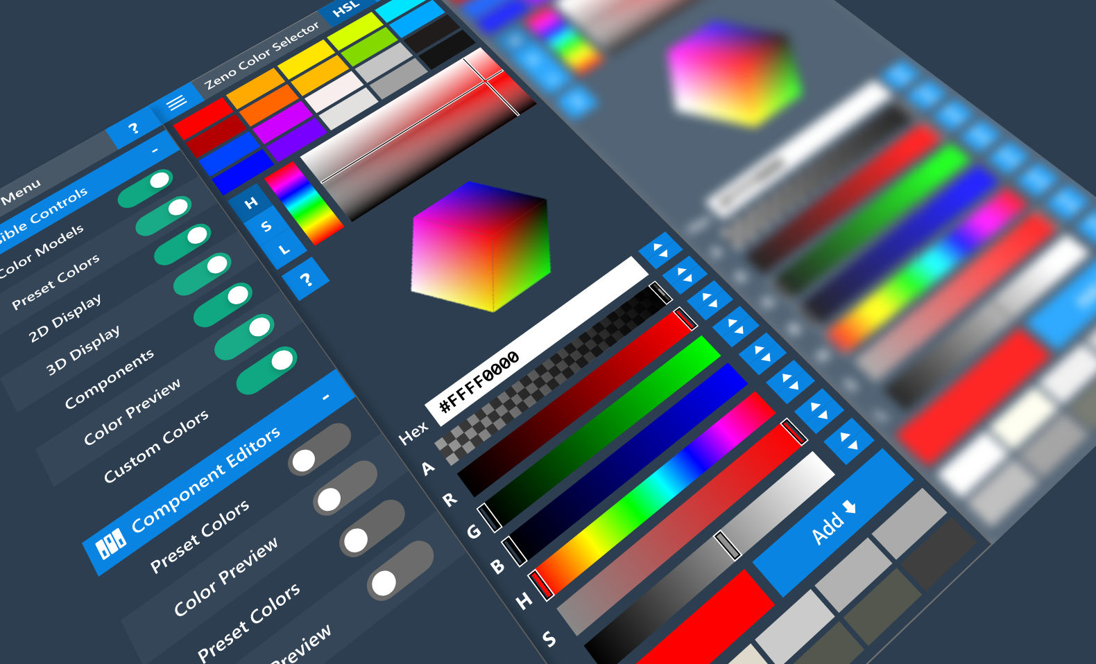
Figure:Prototyped UI components displayed in Adobe XD.
Table of Contents:
1. Overview
This color selector project has two main objectives:
- To create an application with maximum flexibility and workflow interoperability.
- To serve as an exploration of the arithmetic and algorithms involved in color models and conversions.
To the first objective, there are many applications that provide color selector functionality (such as GIMP, Photoshop, Illustrator, Inkscape, Blender, etc.), but there are far fewer applications that provide readily-accessible flexibility in terms of color selection mechanisms. By incorporating UI concepts such as fluid resizing, scalable controls, and interface customization to the scope of color selection, I hope to enhance the UX of end users by facilitating selective UI functionality. In terms of the exploratory project aspect, I have always been curious about the math that goes into calculating the states of various color widgets in larger applications; I hope to share through this blog some of the interesting insights gained from implementing color processing algorithms (detailed in Part two of this blog series).
Figure:Video overview of the main UI/UX features.
The color selector's main features can be grouped into functional areas:
- Color model selection - switch between Hue Saturation Lightness (HSL), Hue Saturation Value (HSV), and Alpha Red Green Blue (ARGB).

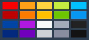
- Preset color selection - define preset colors at compile-time and change them at run-time.
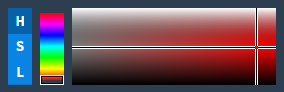
- Color channel editor - view and edit colors using interactive graphical representations of each HSL/HSV component.
- 3D color model viewer - view and edit colors using interactive 3D models depicting HSL and HSV color spaces.
- Hexadecimal (hex) entry - type, copy, and paste 6 character (RGB) or 8 character (ARGB) hex strings, with or without the preceding # character.

- ARGB channel and HSL/HSV component editors - slider-based, text-based, and step-based editing for all channels and components.

- Current color preview and selector - button to preview the current color and trigger a selection event.

- Custom color management - save and delete custom colors.
- UI Customization - show/hide specific areas of the UI via the main menu.
2. How It Works
The code is structured as a WPF Control Library, which enables the color selector to be imported as a Control into other WPF applications. In order to separate the presentation of the Control from the logic, the color selector was constructed using a ControlTemplate with certain expected named Control "parts" that are retrieved at run-time. Since all template parts are optional, the end-user has near-complete flexibility regarding the visual presentation of the color selector. A robust and well-designed default ControlTemplate is supplied in the "Themes/Generic.xaml" file. To use the color selector as a standalone tool, a companion application is included in the source code that opens the color selector as an executable.
<Style TargetType="{x:Type local:ColorSelector}">
        <Setter Property="Background"
                Value="#2c3e50" />
        <Setter Property="Template">
            <Setter.Value>
                <ControlTemplate TargetType="{x:Type local:ColorSelector}">
                    <Grid>
                        <Grid Background="{TemplateBinding Background}" x:Name="mainInterface">

...Source:Themes/Generic.xaml
There are many named parts specified in the code that correspond to specific UI functionality. If these named parts are present in a custom ControlTemplate at run-time, then they are "wired-up" with specific event handlers and bindings - this is significant, since it allows the Control implementer to specify the named parts without needing to know exactly what those parts do - the code handles the complexities of bindings and event handling. If the implementer desires, the bindings and public event handlers can still be manually defined in their custom ControlTemplate, although certain logical features will override any conflicting XAML-defined bindings and event handlers at run-time. An example of a named part defined in the XAML ControlTemplate and its corresponding logic code is shown below:
<Button x:Name="PART_menuOpenButton"
    Style="{StaticResource ButtonStyle1}"
    Height="26"
    Width="41"
    ToolTip="Open Menu">
    <TextBlock Style="{StaticResource buttonText}" Text="≡" Foreground="White" FontSize="24"
                FontWeight="Normal" LineHeight="24" LineStackingStrategy="BlockLineHeight"/>
</Button>
[TemplatePart(Name = nameof(TemplatePart.PART_menuOpenButton), Type = typeof(ButtonBase))]
...
public override void OnApplyTemplate()
{
...
MenuOpenButtonBase = GetTemplateChild(nameof(TemplatePart.PART_menuOpenButton)) as ButtonBase;
...
}
private ButtonBase? menuOpenButtonBase;
private ButtonBase? MenuOpenButtonBase
{
get { return menuOpenButtonBase; }
set
{
if (menuOpenButtonBase != null)
{
menuOpenButtonBase.Click -= new RoutedEventHandler(MenuButtonBase_Click);
}
menuOpenButtonBase = value;
if (menuOpenButtonBase != null)
{
menuOpenButtonBase.Click += new RoutedEventHandler(MenuButtonBase_Click);
}
}
}
...
private void MenuButtonBase_Click(object sender, RoutedEventArgs e)
{
IsMenuOpen = !IsMenuOpen;
}Sources:Themes/Generic.xaml, ColorSelector.cs
When the user interacts with the application, such as by editing a color, DependencyProperties and RoutedEvents that govern application state and behavior are referenced and modified. For example, when the user edits a color by changing the alpha channel value, the alpha channel's corresponding DependencyProperty processes the change and propagates that change to the current color, which eventually results in a CurrentColorChangedEvent being raised:

Figure:Alpha channel editors - the Slider derives from the RangeBase class.
readonly static DependencyProperty ARangeBaseValueProperty =
    DependencyProperty.Register(nameof(ARangeBaseValue), typeof(double), typeof(ColorSelector), new PropertyMetadata(Convert.ToDouble(DefaultColor.A), new PropertyChangedCallback(ARangeBaseValueChanged)));

private static void ARangeBaseValueChanged(DependencyObject d, DependencyPropertyChangedEventArgs e)
{
    ColorSelector selector = (ColorSelector)d;
    if (selector.A != selector.ARangeBaseValue)
    {
        selector.A = selector.ARangeBaseValue;
    }
}

public static readonly DependencyProperty AProperty =
    DependencyProperty.Register(nameof(A), typeof(double), typeof(ColorSelector), new PropertyMetadata(Convert.ToDouble(DefaultColor.A)));

public double A
{
    get { return (double)GetValue(AProperty); }
    set
    {
        SetValue(AProperty, value);
        if (ARangeBaseValue != A)
        {
            ARangeBaseValue = A;
        }
        if (ATextBoxValue != A)
        {
            ATextBoxValue = A;
        }

        if (IgnoreChange)
            return;

        if (CurrentColor.A != A)
            RefreshCurrentColor(new RawColor(A, R, G, B));
    }
}

...

public void RefreshCurrentColor(RawColor rawColor)
{
    if (rawColor is null)
        return;

    CurrentColor = new RawColor( rawColor.A, rawColor.R, rawColor.G, rawColor.B );
    ProcessColorChange("");
    RefreshRangeBaseVisuals();
}

...

public void ProcessColorChange(string originatingPropertyName = "")
{
    RawColor c = CurrentColor;
    if (c is null)
        return;

    ...

    RaiseCurrentColorChangedEvent();
}

...

public static readonly RoutedEvent CurrentColorChangedEvent = EventManager.RegisterRoutedEvent(
name: nameof(CurrentColorChanged),
routingStrategy: RoutingStrategy.Direct,
handlerType: typeof(RoutedEventHandler),
ownerType: typeof(ColorSelector));

void RaiseCurrentColorChangedEvent()
{
    RoutedEventArgs routedEventArgs = new(routedEvent: CurrentColorChangedEvent);
    RaiseEvent(routedEventArgs);
}Source:ColorSelector.cs
The above patterns are repeated numerous times for most functional aspects of the color selector; these patterns enable modularity of features and serve to elegantly decouple the UI from the logical-code.
3. Summary of Features
3.1. User Interface
The User Interface is comprised of two groups: the primary controls appearing within the application window and the secondary controls within the menu overlay. The UI was designed according to certain modern "flat" UI principles, including emphasis on uniformity of layout and simplicity of element presentation. The initial prototype of the application was created in Adobe XD in order to rapidly experiment with layout and design decisions.
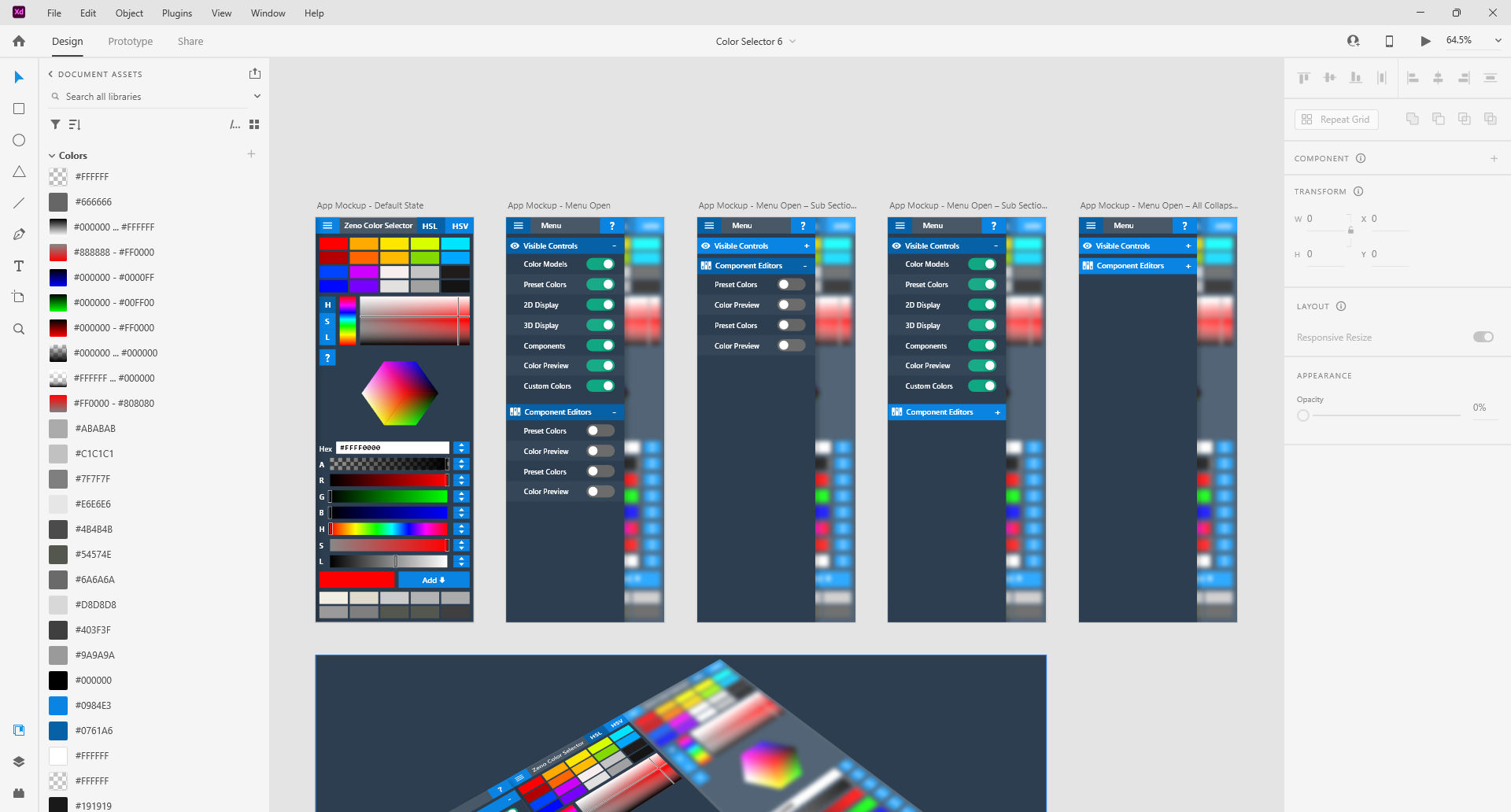
Figure:Adobe XD artboards showing the prototyped UI.
The primary control area was implemented in XAML using a Grid-based layout, with a ScrollViewer automatically appearing if the Window is resized smaller than the area of the controls layout. The preset and custom color selectors are both Selector Controls that display the collections of colors using DataTemplates.
3.1.1. Color Channel Editor
The color channel editor is also a Selector that displays a list of the color components available for the current color model with a RangeBase and rectangular graphical area that corresponds to the selected component. The graphical area consists of X-axis and Y-axis guides that intersect upon the coordinate representative of the current color; these guides are controlled by bindings in the code and area updated each time the component selection is changed. The background of the graphical area contains layers depicting the total range of colors for the current component, and also utilizes bindings to update the display whenever a color edit occurs. If the user clicks or drags within the graphical component area, the mouse coordinate is processed into color component information and updates the current color.
Figure:Color Component Display.
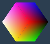
3.1.2. 3D Color Model Viewer
The 3D Color Model viewer was somewhat complicated to implement, although very satisfying once completed. Using the 3D APIs provided by WPF, a hierarchy of objects is required to render the models: Viewport3D -> ModelVisual3D -> Model3DGroup -> GeometryModel3D -> MeshGeometry3D. The Viewport3D object is the parent of the 3D visualization and renders a ModelVisual3D based on the specified camera and clipping behavior - I chose an orthographic camera in order to display the models without perspective distortion. The ModelVisual3D object serves as a parent container for individual 3D elements, such as lights and models. The Model3DGroup is an object that enables using multiple 3D elements as one unit, and is the direct parent of the geometry models and lights. The GeometryModel3D object contains the specific Geometry object and any materials applied to that object. The MeshGeometry3D is a Geometry3D object that contains Positions, Normals, TextureCoordinates, and TriangleIndices collections for storing vertex and triangle information.
Figure:3D Color Model Viewer.
Using Blender, I was able to export a Collada (.dae) file of the basic cube and cone shapes, and after opening the export files, I extracted the Positions, Normals, TextureCoordinates, and TriangleIndices information and transposed them into C# code. There is a caveat regarding the WPF 3D API: it seems that the default 3D coordinate system uses the Y-axis as the "up" direction and the Z-axis as the "forward" direction, whereas Blender uses a default system of Y-axis "forward" and Z-axis "up"; for the Collada export format, Blender provides options for setting these directions - which I did to match the WPF defaults. After some additional tinkering with the WPF OrthographicCamera and ScaleTransform3D applied to the Model3DGroups, I was able to display the untextured cube model. For the cone model, I decided to procedurally generate the faces and base of the cone from sliced geometry triangles exported from Blender. The cube and cone models both are illuminated by an AmbientLight that casts no shadows.
public Model3DGroup GenerateRgbCubeModel3DGroup()
{
    Model3DGroup model3DGroup = new();
    model3DGroup.Transform = new Transform3DGroup()
    {
        Children =
        {
            new ScaleTransform3D(new Vector3D(-.25, -.25, -.25)),
            new RotateTransform3D()
            {
                Rotation = new AxisAngleRotation3D(new Vector3D(-1, 0, 1), -90)
            }
        }
    };

    MaterialGroup materialGroup1 = new();
    materialGroup1.Children.Add(faceBrushDiffuseMaterialDesaturated1);
    materialGroup1.Children.Add(faceBrushDiffuseMaterial1);
    GeometryModel3D face1Geometry = new()
    {
        Material = materialGroup1,
        Geometry = new MeshGeometry3D()
        {
            Positions = new Point3DCollection(new List<Point3D>()
            {
                new Point3D(1, -1, 1),
                new Point3D(1, 1, 1),
                new Point3D(-1, 1, 1),
                new Point3D(-1, -1, 1),
            }),

            Normals = new Vector3DCollection(new List<Vector3D>()
            {
                new Vector3D(0, 0, 1),
                new Vector3D(0, 0, 1),
                new Vector3D(0, 0, 1),
                new Vector3D(0, 0, 1),
            }),

            TextureCoordinates = new PointCollection(new List<Point>()
            {
                new Point(0.375, 0.25),
                new Point(0.625, 0.25),
                new Point(0.625, 0.5),
                new Point(0.375, 0.5),
            }),

            TriangleIndices = new Int32Collection(new List<int>()
            {
                0, 1, 2, 0, 2, 3,
            }),
        }
    };

    ...

    model3DGroup.Children.Add(new AmbientLight());

    model3DGroup.Children.Add(face1Geometry);

    ...

    return model3DGroup;
}Source:ColorSelector.cs
For the cube's material, I used different DiffuseMaterials for each face in order to render unique colors that would match an RGB color cube. The material of each cube face was assigned an ImageBrush containing a Bilinear Interpolated group of colors that were carefully organized in order to create a seamless color spectrum around the entire cube. In order to display the current saturation, the GeometryModel3D of each cube face has a MaterialGroup that contains both the colored Bilinear Interpolated ImageBrush and an additional grayscale Bilinear Interpolated ImageBrush. The colored ImageBrush's OpacityProperty is bound to the Saturation DependencyProperty, so that the colors of the cube fade and grow in direct proportion to changes in the current saturation value.
For the cone's material, I used different DiffuseMaterials for each face in order to render unique LinearGradientBrushes that would match a HSV color cone. The brushes were procedurally generated with each cone face in order to span the 360° hue spectrum, seamlessly encircling the cone. In order to display the poles of color extremes at minimum value and maximum saturation, each face has an additional brush added to its MaterialGroup: a LinearGradientBrush interpolating black to transparent for the faces, and a LinearGradientBrush interpolating white to transparent for the base triangles. Similar to the cube, additional brushes were defined and bound to show changes in saturation.
public Model3DGroup GenerateRgbConeModel3DGroup()
{
    Model3DGroup model3DGroup = new();
    model3DGroup.Transform = new Transform3DGroup()
    {
        Children = {
            new ScaleTransform3D(new Vector3D(-.3, -.3, -.3)),
            new TranslateTransform3D(new Vector3D(0,0,0)),
            new RotateTransform3D()
            {
                Rotation = new AxisAngleRotation3D(new Vector3D(-1, 0, 0), 90)
            }
        }
    };

    DiffuseMaterial shaderBlack = new(new LinearGradientBrush(new GradientStopCollection() { new GradientStop((Color)ColorConverter.ConvertFromString("#00000000"), 0), new GradientStop(Colors.Black, 1) }) { EndPoint = new Point(1, 0) });
    DiffuseMaterial shaderWhite = new(new LinearGradientBrush(new GradientStopCollection() { new GradientStop(Colors.Transparent, 0), new GradientStop(Colors.White, 1) }) { StartPoint = new Point(0,1), EndPoint = new Point(0, 0) });
    DiffuseMaterial shaderGray = new(new SolidColorBrush(Colors.Gray));

    int faces = 128;

    for (int i = 0; i < faces; ++i)
    {

        DiffuseMaterial material = new(new SolidColorBrush(GetRgbColorFromModel((360.0 * i) / faces, 1, 1)));
        Binding brushOpacity = new(nameof(S)) { Mode = BindingMode.OneWay, Source = this };
        BindingOperations.SetBinding(material.Brush, Brush.OpacityProperty, brushOpacity);

        MaterialGroup group = new();

        group.Children.Add(shaderGray);
        group.Children.Add(material);
        group.Children.Add(shaderBlack);

        MaterialGroup group2 = new();

        group2.Children.Add(shaderGray);
        group2.Children.Add(material);
        group2.Children.Add(shaderWhite);

        ...

    }

    ...

}Source:ColorSelector.cs
3.1.3. Component and Channel Editors
The hex, color component and channel editors are relatively straight-forward. They are arranged in a Grid-based format. The R, G, B, H, S, L, and V RangeBases feature backgrounds that change in tandem with edits to the current color. Each channel and component RangeBase, except hue, has GradientStops with bindings that display the minimum and maximum range depending on the state of the current color; the hue RangeBase background changes to show relative saturation. The values of all RangeBases and TextBoxes use two-way bindings to keep their values in-sync with current color edits, while also permitting edit actions. Validators are used in order to prevent invalid data from being entered into the TextBoxes, and Validation.ErrorTemplates are used to visually notify the user if a specified value is invalid. The up and down arrow buttons are used to fine-tune their corresponding values in discrete steps.
Figure:Component and channel editors.
3.1.4. Custom Colors
The custom color controls area contains buttons for adding and deleting custom colors, as well as a Selector for displaying and selecting previously saved custom colors.
Figure:Custom colors section.
3.1.5. Menu
The menu interface is hidden by default and is toggled visible/hidden by the menu button in the upper-left hand corner of the application. Showing the menu slides it into view as an overlay on top of the main interface. When the menu is visible, the main interface is blurred in order to focus attention on the menu and help differentiate the menu container from the application container. The blur effect is achieved by applying and animating a BlurBitmapEffect to a Border within the Menu's parent container.
Figure:Revealing the menu blurs the main interface.
The Visible Controls and Component Editors sections contain toggle switches for controlling the visibility of major sections of the UI. The toggle switches are ToggleButtons with custom ControlTemplates defined in XAML. When a toggle switch is switched on or off, a corresponding boolean DependencyProperty in the ColorSelector class is modified, which acts as the data source for a XAML binding that controls the visibility of the targeted UI section.
Figure:The menu contains toggle switches for controlling visibility of UI sections.
3.2. User Experience
The UX was designed to provide a streamlined workflow with intuitive controls and feedback mechanisms. The main UX features can be summarized as follows:
- Selective UI control visibility - visibility of the individual color selector controls can be modified from the menu.
- Fluid application resize - the color selector controls fluidly resize to fit the desired Window size.
- Feedback for data input - the user is notified if invalid data is entered into text inputs.
- Animations conveying action - animations are used to emphasize certain UI actions, such as when saving custom colors or toggling the menu.
- Monospaced numeric text areas - text areas conveying numeric information have monospaced fonts in order to prevent "jitter" when values rapidly change.
- Uniformity of layout - each Control is separated by a multiple of 4 pixels, with 8 pixels being the predominant separation distance.
- Informative tooltips - when certain controls are hovered, tooltips will provide additional context.

Figure:Validator error template providing visual feedback.
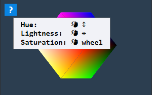
Figure:Informative tooltips provide additional context.
Figure:Selective UI control visibility.
4. Conclusion
That about covers the Color Selector project from a high-to-medium level overview. Part two covers the aspects of the color processing math, algorithms, and data, as well as how unit testing is performed with NUnit. The complete source is available via GitHub. Thanks for reading!