In this article, I cover the design and construction of a concept user interface (UI) for a vehicle dashboard. The UI was implemented with C# using Windows Presentation Foundation (WPF).
Figure:Video overview of the main UI/UX features.
Table of Contents:
- Overview
- How It Works
- Summary of Components
- Tutorial
- Conclusion
1. Overview
This project is a concept user interface for a vehicle dashboard / infotainment display along with a set of test tools that would theoretically be useful during Human-Systems Integration (HSI) tests. The dashboard has five main pages: Home, Driver, Navigation, Media, and Phone. Each page has a touch-friendly layout that also accommodates mouse input. The goals of this project were:
- to create a realistic UI with interactive controls and
- to test the controls via simulated data.
The end result is a neat concept UI that is fun to play with (at least I think it is 👍) and test changes in state. It would also not be that difficult to inject real data and services into the UI, since the mock-up business logic is loose-coupled to the UI.
2. How It Works
The user interface is driven by (pun intended) a main ViewModel that contains properties and methods governing application state and behavior. This main ViewModel is organized into child ViewModels according to the different groups of main application functionality: dashboard navigation / global dashboard functions, driving functions, media functions, and phone communication functions. The eXtensible Application Markup Language (XAML) code that defines the "skeleton" of the UI incorporates the ViewModel logic through various data-bindings that enable the user to influence application state. The web-browser-like navigation is handled by WPF's built-in navigation service, facilitated by the use of Page controls that are loaded within a central Frame control. Both the front end XAML and the back end ViewModel components are modular, which would make it much easier for a team of programmers to tackle different aspects of the software development simultaneously.
3. Summary of Pages
3.1. Home
The home page is the first page a user sees upon application startup. The rectangular displays are miniature overviews of the major application areas and also serve as page navigation buttons when pressed.
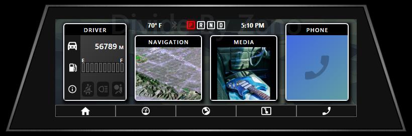
Figure:Home Page.
3.2. Driver
The driver page contains information related to the state of the vehicle, such as current speed, transmission state, and warning indicators. The dials are custom WPF UserControls.
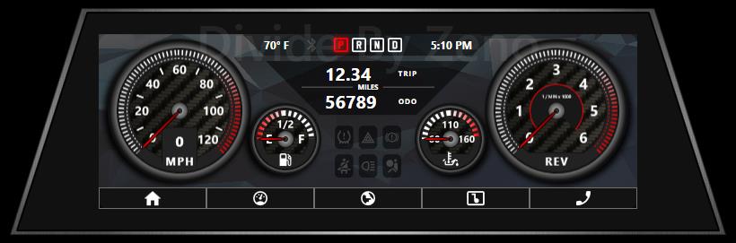
Figure:Driver Page.
3.3. Navigation / Weather
The navigation page contains a map depicting the user's desired destination along with a list of navigation directions. Along the left margin of the page there is a column of buttons that would activate related functions; from top to bottom, these buttons are: Search, Weather, Jump-To-Current-Location, and Cancel Trip.
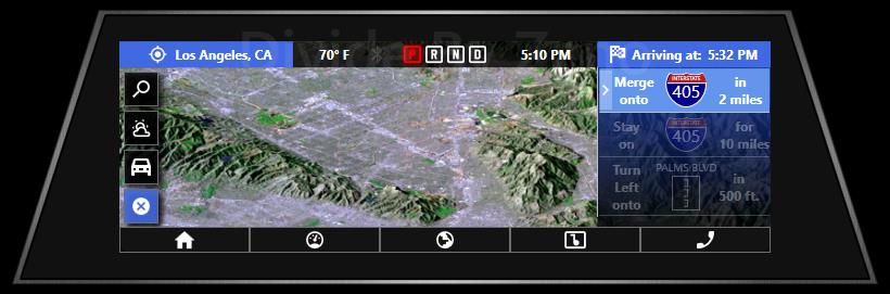
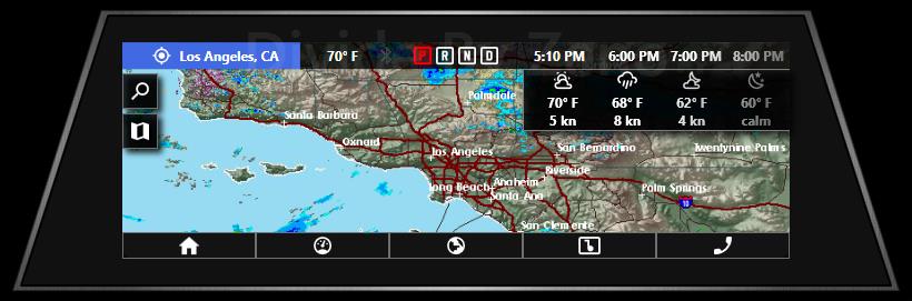
Figure:Navigation and Weather Pages.
3.4. Media
The media page contains controls related to media selection and playback. Along the left margin of the page there is a column of buttons that would activate related functions; from top to bottom, these buttons are: View Media Library, Radio, USB Device Control, and Bluetooth Connectivity. To the right of this column is a section for volume control. The center and right side of the display indicates the current media item, along with metadata information such as release title and album art.
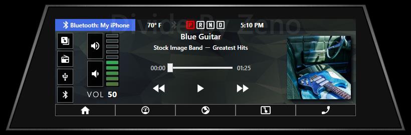
Figure:Media Page.
3.5. Phone
The phone page allows the user to make and receive calls. Similar to the navigation and media pages, a column of buttons along the left margin of the page would be used to activate related features (from top to bottom: Place Call, Contacts Library, Call History, and Bluetooth Connectivity). Adjacent to this column is a volume control section and keypad. The right-half of the screen contains call interaction information and phone controls.
Figure:Phone Page.
3.6. Test Tools
In order to test the UI in real-time, I created a test tools section containing input controls (Buttons, ToggleButtons, Sliders) that correspond to different parts of the application business logic; these input controls allow the user to supply the application with mock data in order to observe changes in the UI:
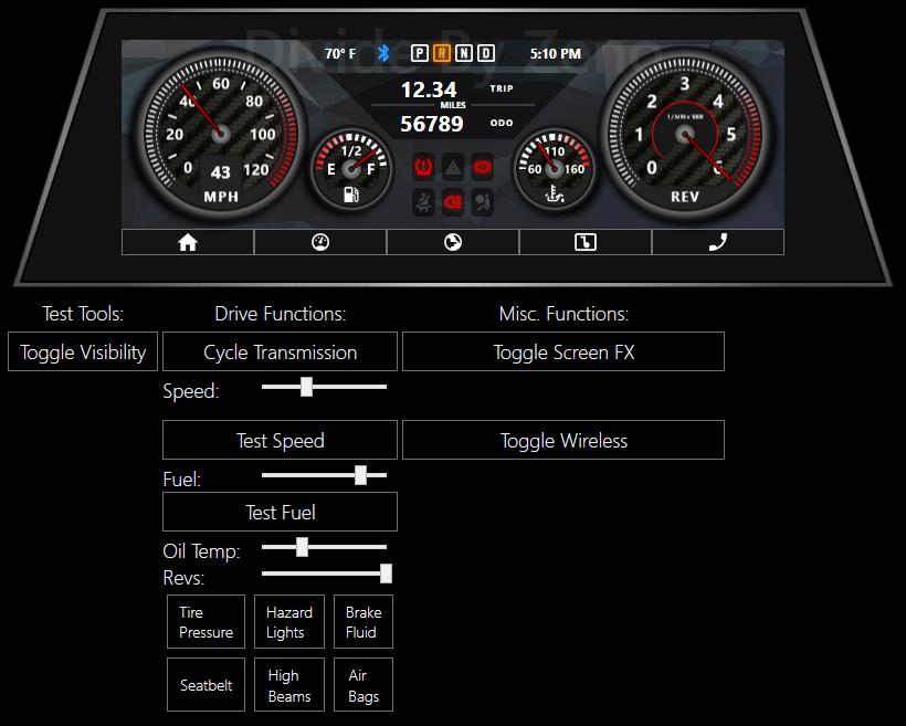
Figure:The test tools section, which enables the user to test the application at run-time with mock data.
For a video of the test tools in action, see the test tools Tutorial section.
4. Tutorial
The following is a general description of the thought process and steps taken to build this UI from scratch, along with several in-depth descriptions of prominent UI features. It is not a complete step-by-step guide, but readers can follow along with the source code available via GitHub. The code snippets below will most likely not compile if copy/pasted on their own and are included only as quick references to the complete source code.
4.1. The UI Housing (Hardware Imitation)
The very first step I took was to create a new Visual Studio WPF project. Since I was envisioning this UI as being a part of some type of vehicle, I started by looking at many different infotainment / multimedia systems inside cars of different manufacturers. Many modern vehicles have at least one LED-screen type display, and a majority of those appear to have at least two screens: one for situational awareness indicators (speedometer, warning indicators, rev meter, etc.) and another for entertainment / information / communication purposes (navigation, radio, music, Bluetooth connectivity, etc.). These groups are not mutually exclusive, but a good generalization to start with. I decided that I wanted to create an infotainment display, but one that was also capable of showing the situational awareness readouts - maybe the passenger would to watch the speedometer from the infotainment screen (I don't know 🤷♂️). Ideally, I would have made a second display that was dedicated to showing the situational awareness readouts, but that would have involved modeling a dashboard and probably a steering wheel, and then a windshield for the Heads Up Display (HUD), and ... that seemed like a rabbit hole so I stuck to the infotainment screen (FULL vehicle dashboard coming soon 😀).
Next, I started to create a mock-up of the hardware that houses the display. Most vehicles have a roughly-rectangular / tablet-like screen for their infotainment displays; what I ended up with is a trapezoid exterior housing containing a rectangular interior screen:
Figure:Creating a mock-up of the hardware.
Inside MainWindow.xaml, the trapezoid shape was achieved by using two Polygon objects with different values for their Fill Property:
    <Grid
MaxWidth="800"
HorizontalAlignment="Center"
VerticalAlignment="Center"
Height="255">
<Polygon
    StrokeLineJoin="Round"
    StrokeThickness="2"
    Stroke="#88000000"
    HorizontalAlignment="Center"
    VerticalAlignment="Center"
    Stretch="Fill">
    <Polygon.Fill>
        <ImageBrush
            Stretch="Fill"
            AlignmentX="Center"
            ImageSource="pack://application:,,,/VehicleDashConcept;component/UI/Textures/silver.jpg"/>
    </Polygon.Fill>
    <Polygon.Points>
        <Point X="80" Y="0" />
        <Point X="720" Y="0"/>
        <Point X="800" Y="200"/>
        <Point X="0" Y="200"/>
    </Polygon.Points>
</Polygon>
<Polygon
    Margin="8,5"
    Stroke="Black"
    Fill="#111"
    StrokeLineJoin="Round"
    StrokeThickness="2"
    HorizontalAlignment="Center"
    VerticalAlignment="Center"
    Stretch="Fill">
    <Polygon.Points>
        <Point X="80" Y="0" />
        <Point X="720" Y="0"/>
        <Point X="800" Y="200"/>
        <Point X="0" Y="200"/>
    </Polygon.Points>
</Polygon>
<Border
    Visibility="Visible"
    Margin="100,30"
    CornerRadius="10"
    Background="#282828">

    ...

</Border>

...

</Grid>
Source:MainWindow.xaml
The two Polygon objects create the outer and inner bezel of the trapezoid, while the Border at line 42 is the inner-rectangular screen display. The next step was to create simulated pixel-grid, dust, and ambient light effects, to more closely replicate what the UI may look like if it were tested in-the-field:
Figure:Simulating dust, light, and pixel-grid effects.
These effects were achieved by using several different layers that overlay the main content of the display: one layer for the pixel grid texture, one layer for the dust and scratches texture, and one for the different ambient light textures. The textures themselves are just PNG files with transparent backgrounds. All of the effects are able to be toggled Visible/Collapsed via a DataTrigger that is databound to the AreScreenEffectsVisible Property in DashboardViewModel.cs:
<Grid IsHitTestVisible="False">
    <Grid.Style>
        <Style TargetType="{x:Type Grid}">
            <Setter Property="Visibility" Value="Visible"/>
            <Style.Triggers>
                <DataTrigger Binding="{Binding AreScreenEffectsVisible}" Value="False">
                    <Setter Property="Visibility" Value="Collapsed"/>
                </DataTrigger>
            </Style.Triggers>
        </Style>
    </Grid.Style>

    ...

</Grid> Source:MainWindow.xaml
4.2. UI Navigation and ViewModel
The next task was to figure out how to organize the UI and to switch between different pages. WPF's built-in navigation infrastructure is well-suited for multiple types of navigation topologies, but especially browser-like navigation. I decided that I would use a Frame control to display the content of different Page controls, and that there would be one page per logical group in the UI: Home, Driver, Navigation / Weather, Media, and Phone. Beneath the Frame, there is a row of Buttons that represent the main pages of UI and, when clicked, execute an ICommand that navigates to the corresponding page. Overlaid on top of the Frame, there is an information section that shows things like outdoor temperature, Bluetooth connectivity, drive mode, and current time, as well as communication and navigation related statuses:
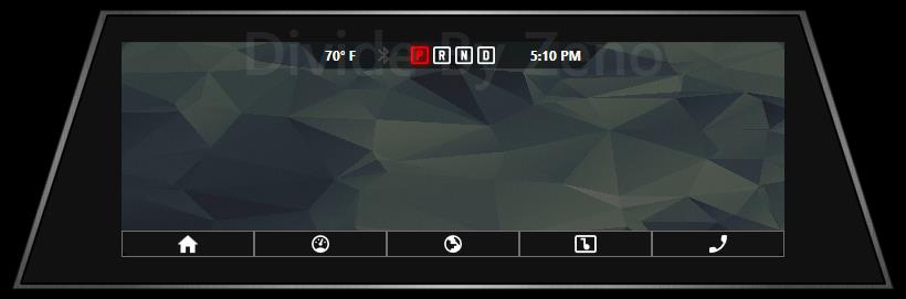
Figure:An empty page. The Frame that displays Page content is situated the middle, above the row of Buttons for navigating to each page and underneath the information section overlay.
The above figure shows a Page control, with a fancy background image that has lots of cool geometric shapes, being displayed inside the invisbile Frame control. Since I wanted the information section to be displayed on multiple pages, but with certain Page-specific context changes, I created a new UserControl to contain its contents (VehicleDashConcept - UI - Controls - DashSituationalAwarenessReadout.cs):
Figure:The UI for the information section UserControl.
The next task was creating a simple ViewModel wiring up enough business logic (code-behind in C#-speak) to make the navigation between pages happen. I like to use the Model-View-ViewModel (M-V-VM) design paradigm for keeping my XAML and CS code modular and maintainable. The ViewModel for this project inherits from a ViewModel base class (BaseViewModel) and contains a combination of Properties and Commands for interacting with the UI:
public class DashboardViewModel : BaseViewModel
{
    public PhoneViewModel phoneViewModel { get; set; }
    public DriverViewModel driverViewModel { get; set; }
    public MediaViewModel mediaViewModel { get; set; }

    public static int MAX_AUDIO = 100;

    public ICommand NavigateToPage { get; set; }

    ...

    public DashboardViewModel(Frame f)
    {
        MainNavigationFrame = f;
        SetupViewModel();
    }

    private void SetupViewModel()
    {
        phoneViewModel = new PhoneViewModel(this);
        driverViewModel = new DriverViewModel(this);
        mediaViewModel = new MediaViewModel(this);

        NavigateToPage = new DelegateCommand(OnNavigateToPage, null);

        IncreaseVolume = new DelegateCommand(OnIncreaseVolume, null);
        DecreaseVolume = new DelegateCommand(OnDecreaseVolume, null);

        ToggleScreenEffects = new DelegateCommand(OnToggleScreenEffects, null);
        SetScreenFxLight = new DelegateCommand(OnSetScreenFxLight, null);

        ToggleWirelessConnection = new DelegateCommand(OnToggleWirelessConnection, null);
    }

    ...

}Source:VehicleDashConcept - ViewModel - DashboardViewModel.cs
In order to keep code modular and organized, I broke down the business logic for the main sections of the UI into several 'child' ViewModels that reside inside DashboardViewModel (the 'parent') as Properties: PhoneViewModel, DriverViewModel, and MediaViewModel. These child ViewModels are defined inside SetupViewModel(), and each of their constructors accepts a reference to the DashboardViewModel so that properties of one child ViewModel can be accessed in the other child ViewModels (ex. the mediaViewModel can access properties inside the phoneViewModel and vice versa). Also in SetupViewModel() there are definitions for the various ICommands that were declared as Properties of DashboardViewModel.
On line 13, DashboardViewModel(Frame f) calls SetupViewModel() and assigns a value to the MainNavigationFrame, which is the object responsible for managing the UI navigation (in this case, it is a Frame named 'mainNavigationFrame' that resides inside MainWindow.xaml). Since DashboardViewModel is defined as MainWindow's DataContext in the code-behind of MainWindow (i.e. MainWindow.xaml.cs), it has access to the Frame residing in MainWindow's XAML; once DashboardViewModel has a reference to this object, the business logic can use it to issue navigation commands.
With the above infrastructure in place, the logic to navigate between pages is relatively simple: the NavigateToPage ICommand in DashboardViewModel accepts a Page's string URI as a CommandParameter, which is then passed to the MainNavigationFrame as the navigation target:
/// <summary>
/// Navigates to the specified page.
/// </summary>
/// <param name="pageUri">The URI string of the Page control to navigate to.</param>
private void OnNavigateToPage(object pageUri)
{
    if (pageUri == null)
        return;

    MainNavigationFrame.Navigate(new Uri((string)pageUri, UriKind.RelativeOrAbsolute));
}Source:VehicleDashConcept - ViewModel - DashboardViewModel.cs
NavigateToPage can be used in any WPF Control that implements the ICommandSource interface; in the UI XAML, I use it mostly with Buttons:
<Grid Grid.Row="1" Height="24" VerticalAlignment="Bottom">
    <Grid.ColumnDefinitions>
        <ColumnDefinition />
        <ColumnDefinition />
        <ColumnDefinition />
        <ColumnDefinition />
        <ColumnDefinition />
    </Grid.ColumnDefinitions>
    <Button
        Style="{StaticResource DashButton}"
        Tag="H O M E"
        Command="{Binding NavigateToPage, FallbackValue={x:Null}}"
        CommandParameter="pack://application:,,,/VehicleDashConcept;component/UI/DashboardPages/HomePage.xaml">
        <Path Style="{StaticResource DashIconsRotated180}"
              Data="{StaticResource home}" />
    </Button>
    <Button
        Style="{StaticResource DashButton}"
        Grid.Column="1"
        Tag="D R I V E R"
        Command="{Binding NavigateToPage, FallbackValue={x:Null}}"
        CommandParameter="pack://application:,,,/VehicleDashConcept;component/UI/DashboardPages/DriverPage.xaml">
        <Path Style="{StaticResource DashIcons}"
              Data="{StaticResource Gauge}"/>
    </Button>
    <Button
        Style="{StaticResource DashButton}"
        Grid.Column="2"
        Tag="N A V I"
        Command="{Binding NavigateToPage, FallbackValue={x:Null}}"
        CommandParameter="pack://application:,,,/VehicleDashConcept;component/UI/DashboardPages/NavigationPage.xaml">
        <Path Style="{StaticResource DashIconsRotated180}"
              Data="{StaticResource Earth}"/>
    </Button>
    <Button
        Style="{StaticResource DashButton}"
        Grid.Column="3"
        Tag="M E D I A"
        Command="{Binding NavigateToPage, FallbackValue={x:Null}}"
        CommandParameter="pack://application:,,,/VehicleDashConcept;component/UI/DashboardPages/MediaPage.xaml">
        <Path Style="{StaticResource DashIconsRotated180}"
              Data="{StaticResource music_video}"/>
    </Button>
    <Button
        Style="{StaticResource DashButton}"
        Grid.Column="4"
        Tag="P H O N E"
        Command="{Binding NavigateToPage, FallbackValue={x:Null}}"
        CommandParameter="pack://application:,,,/VehicleDashConcept;component/UI/DashboardPages/PhonePage.xaml">
        <Path Style="{StaticResource DashIconsRotated180}"
              Data="{StaticResource phone}"/>
    </Button>
</Grid>Source:MainWindow.xaml
When using WPF's navigation code, there is a tiny detail that is slightly annoying: each Page, when navigated to, creates a new DataContext for itself by default. In the case of this application, this is not desirable, because I want each Page to inherit its DataContext from MainWindow in order to access the DashboardViewModel. The solution involves defining a handler for the navigation Frame's Navigated Event, which always sets the DataContext of any newly-navigated-to content to DashboardViewModel:
<Frame
    NavigationUIVisibility="Hidden"
    x:Name="mainNavigationFrame"
    Navigated="mainNavigationFrame_Navigated"
Source="pack://application:,,,/VehicleDashConcept;component/UI/DashboardPages/HomePage.xaml" />Source:MainWindow.xaml
private void mainNavigationFrame_Navigated(object sender, NavigationEventArgs e)
{
    ((FrameworkElement)e.Content).DataContext = dashboardViewModel;
}Source:MainWindow.xaml.cs
4.3. Creating the Pages
With the navigation squared-away, I moved on to creating each page of the UI. Since I wanted the Home page to contain miniature summaries of the other pages, I decided to do that page last in order to use any resources I created for the other pages.
4.3.1. Driver
For the Driver page, I envisioned a readout of all the major items that a driver would typically see on the display behind / around their steering-wheel: a speedometer, a rev-counter, a fuel gauge, an oil temperature gauge, trip distance readout, and warning indicators. Having figured out the main pieces of information, I created a new UserControl called DashDial for depicting the different gauges. DashDial contains properties for adjusting the appearance of the gauge and code for moving the gauge needle depending on the DashDial's Value Property (the Rectangle in the DashDial.xaml snippet below is the gauge needle).
public partial class DashDial : UserControl
{
    public DashDial()
    {
        InitializeComponent();
    }

    public static readonly DependencyProperty ValueProperty =
        DependencyProperty.Register(nameof(Value), typeof(double), typeof(DashDial), new PropertyMetadata(0.0));

    public double Value
    {
        get { return (double)GetValue(ValueProperty); }
        set { SetValue(ValueProperty, value); }
    }

    /* Faceplate --------------------- */

    public static readonly DependencyProperty FaceplateStrokeProperty =
        DependencyProperty.Register(nameof(FaceplateStroke), typeof(Brush), typeof(DashDial), new PropertyMetadata(new SolidColorBrush(Colors.Black)));

    public Brush FaceplateStroke
    {
        get { return (Brush)GetValue(FaceplateStrokeProperty); }
        set { SetValue(FaceplateStrokeProperty, value); }
    }

    ...
}Source:VehicleDashConcept - UI - Controls - DashDial.xaml.cs
<UserControl x:Class="VehicleDashConcept.UI.Controls.DashDial"
     xmlns="http://schemas.microsoft.com/winfx/2006/xaml/presentation"
     xmlns:x="http://schemas.microsoft.com/winfx/2006/xaml"
     xmlns:mc="http://schemas.openxmlformats.org/markup-compatibility/2006"
     xmlns:d="http://schemas.microsoft.com/expression/blend/2008"
     xmlns:local="clr-namespace:VehicleDashConcept.UI.Controls"
     xmlns:System="clr-namespace:System;assembly=mscorlib"
     mc:Ignorable="d"
     d:DesignWidth="160"
     x:Name="Dial">

     ...

     <Rectangle
        Height="{Binding NeedleHeight, FallbackValue=60, ElementName=Dial}"
        Margin="{Binding NeedleMargin, FallbackValue='0,60,0,0', ElementName=Dial}"
        Width="{Binding NeedleWidth, FallbackValue=4, ElementName=Dial}"
        Stroke="{Binding NeedleStroke, FallbackValue=Black, ElementName=Dial}"
        StrokeThickness="{Binding NeedleStrokeThickness, FallbackValue=1, ElementName=Dial}"
        Fill="{Binding NeedleFill, FallbackValue=White, ElementName=Dial}"
        VerticalAlignment="Center"
        RadiusX="8"
        RadiusY="8"
        RenderTransformOrigin="0.5,0">
        <Rectangle.Style>
            <Style TargetType="{x:Type Rectangle}">
                <Setter Property="RenderTransform">
                    <Setter.Value>
                        <RotateTransform Angle="{Binding Source={StaticResource RotateResource}, Path=Angle, Mode=OneWay, FallbackValue=0.0}" />
                    </Setter.Value>
                </Setter>
            </Style>
        </Rectangle.Style>
    </Rectangle>

    ...

</UserControl>Source:VehicleDashConcept - UI - Controls - DashDial.xaml
Implementing the gauges as a UserControl allowed me to reuse an abstract template ...
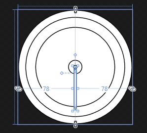
Figure:The default appearance of the DashDial UserControl.
... to create multiple gauges of different styles and sizes:
<p><span class="smaller margin-right-1 bold">Figure:</span><span class="small opacity-8">The speedometer and fuel level indicator are two different instances of the DashDial UserControl.</span></p>
Situated in the lower middle portion of the Page, the warning indicator section contains several reusable ContentControls that are defined inside the DashConceptResources.xaml ResourceDictionary. The ContentControls themselves contain more detailed XAML definitions for icon-based indicators.
Figure:Grid of ContentControl warning indicators.
<Grid
    Width="80"
    Height="64"
    VerticalAlignment="Bottom"
    Margin="0,8"
    x:Name="statusIconsArea">
    <Grid.RowDefinitions>
        <RowDefinition />
        <RowDefinition />
    </Grid.RowDefinitions>
    <Grid.ColumnDefinitions>
        <ColumnDefinition />
        <ColumnDefinition />
        <ColumnDefinition />
    </Grid.ColumnDefinitions>
    <ContentControl
        Content="{StaticResource tirePressureIndicatorModule}" />
    <ContentControl
        Content="{StaticResource hazardLightsIndicatorModule}"
        Grid.Column="1"/>
    <ContentControl
        Content="{StaticResource brakeWarningIndicatorModule}"
        Grid.Column="2"/>
    <ContentControl
        Content="{StaticResource seatBeltIndicatorModule}"
        Grid.Row="1" />
    <ContentControl
        Content="{StaticResource highBeamsIndicatorModule}"
        Grid.Column="1"
        Grid.Row="1" />
    <ContentControl
        Content="{StaticResource airBagIndicatorModule}"
        Grid.Column="2"
        Grid.Row="1" />
</Grid>Source:VehicleDashConcept - UI - DashboardPages - DriverPage.xaml
<Border
    x:Key="tirePressureIndicatorModule"
    x:Shared="false"
    Style="{StaticResource WarningIndicatorBorder}"
    ToolTip="Low Tire Pressure">
    <Path
        Height="Auto"
        Margin="3"
        Data="{StaticResource TirePressureWarning}">
        <Path.Style>
            <Style TargetType="{x:Type Path}" BasedOn="{StaticResource DashIcons}">
                <Setter Property="Fill" Value="#444"/>
                <Style.Triggers>
                    <DataTrigger
                        Binding="{Binding driverViewModel.TirePressureIndicatorState, Mode=OneWay, FallbackValue={x:Null}}"
                        Value="True">
                        <Setter Property="Fill" Value="Red"/>
                        <Setter Property="Effect">
                            <Setter.Value>
                                <DropShadowEffect Color="OrangeRed" BlurRadius="8" ShadowDepth="0" />
                            </Setter.Value>
                        </Setter>
                    </DataTrigger>
                </Style.Triggers>
            </Style>
        </Path.Style>
    </Path>
</Border>Source:VehicleDashConcept - UI - Styles - DashConceptResources.xaml
4.3.2. Navigation / Weather
The Navigation and Weather pages are slightly more complex than the Driver page, in that they each need their own sub-menu system for their context-specific functions. The challenge was to do this without cluttering the main display area, which needed to be relatively open for displaying map data. I decided that a left-aligned column of Buttons would leave enough space for the main content without being obtrusive. Each button performs a different function, from top to bottom: Search (for destinations), Weather, Current Location, and Cancel / Clear current trip:
Figure:A column of left-aligned buttons provides navigation for page-specific features.
The information section at the top of page, in addition to containing the DashSituationalAwarenessReadout UserControl, also contains the current Navigation destination (left-aligned), and the estimated arrival time (right-aligned). Beneath the estimated arrival time readout, there is a ListBox of navigation directions to the current destination; the current direction is placed at the top of the list, beneath future directions that are partially transparent.

Figure:The top section contains both general and page-specific context information.
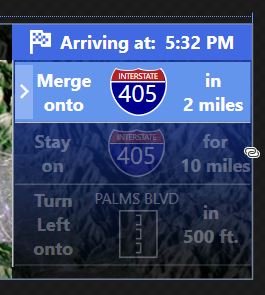
Figure:The ListBox of navigation directions.
Since the navigation and weather pages both display maps of search-able-locations, I decided to group them together. The weather page, accessible via the weather Button on the Navigation Page, displays the current weather radar of the currently selected location, as well as a short-term forecast:
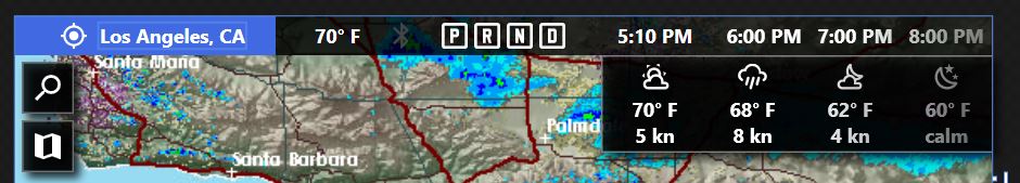
Figure:The Weather page contains radar and forecast information.
Similar to the Navigation page, the Weather Page also has its own left-aligned menu of Buttons and context-specific information to the right: a short-term forecast that slides in discrete steps from right to left as time goes on. There is a subtle fading-out that occurs in the forecast readout to draw the user's eye to the current weather, which is left-aligned.
My favorite feature of both pages is the ability to pan / zoom the map (to a limited extent). It was slightly tricky to pull off, since the actions involved require calculating movement deltas of the mouse as well as taking into account factors like the Clip property of the map container. The XAML is relatively straightforward, with the map image's parent container having its Clip Property set to True, so that the map image can extend beyond the dimensions of the dashboard screen:
<Border
    x:Name="mapImageContainer"
    ClipToBounds="True">
    <Grid
        x:Name="mapImage"
        RenderTransformOrigin="0.5,0.5"
        MouseWheel="Image_MouseWheel"
        MouseLeftButtonDown="Image_MouseLeftButtonDown"
        MouseMove="Image_MouseMove"
        MouseLeftButtonUp="Image_MouseLeftButtonUp">
        <Grid.RenderTransform>
            <TransformGroup>
                <TranslateTransform X="0" Y="0"/>
                <ScaleTransform ScaleX="1" ScaleY="1"/>
            </TransformGroup>
        </Grid.RenderTransform>
        <Image
            Opacity="1"
            ClipToBounds="False"
            RenderTransformOrigin="0.5,0.5"
            RenderOptions.BitmapScalingMode="HighQuality"
            Source="pack://application:,,,/VehicleDashConcept;component/UI/Textures/map_nasa.jpg">
            <Image.RenderTransform>
                <TransformGroup>
                    <TranslateTransform X="-30" Y="0" />
                    <ScaleTransform ScaleX="3.7" ScaleY="3.7" />
                </TransformGroup>
            </Image.RenderTransform>
        </Image>
        <Path
            Height="48"
            Stretch="Uniform"
            Fill="RoyalBlue"
            Stroke="White"
            StrokeThickness="2"
            Data="{StaticResource pin_drop}"
            Style="{StaticResource DashIconsRotated180}">
            <Path.Effect>
                <DropShadowEffect Direction="135" />
            </Path.Effect>
        </Path>
    </Grid>
</Border>
Source:VehicleDashConcept - UI - DashboardPages - NavigationPage.xaml
The Border mapImageContainer contains a Grid named mapImage that contains two Controls: an Image of the map, and a Path icon depicting current user location. mapImage contains the Event handlers for responding to mouse input events, while the Image within contains a TranslateTransform, for panning the map, and a ScaleTransform, for zooming the map. The Event Handlers convert the user's mouse movements into values to use in the Images' TranslateTransform and ScaleTransform objects. Below is the Event Handler for handling mouse wheel input and zooming the image:
private void Image_MouseWheel(object sender, MouseWheelEventArgs e)
{
    const double MIN_ZOOM = .75;
    const double MAX_ZOOM = 2;

    ScaleTransform scaleTransform =
        (ScaleTransform)((TransformGroup)mapImage.RenderTransform).Children.First(s => s is ScaleTransform);

    ImageUtilities.BoundedImageScale(scaleTransform, MIN_ZOOM, MAX_ZOOM, e.Delta);
}Source:VehicleDashConcept - UI - DashboardPages - NavigationPage.xaml.cs
4.3.3. Media
The media page consists of: a left-aligned column of Buttons (like the Navigation/Weather pages) for accessing various page functions, a volume control, a "currently-playing" readout with transport controls, and a visual that corresponds to the current media (album art).
The volume control consists of a VerticalBarMeter UserControl, and two RepeatButtons for adjusting volume up and down; here, I used RepeatButtons instead of regular Buttons so that if the user holds one of the buttons, the button's corresponding action repeats until the user lifts off the button (i.e. the volume will continuously go up or down until the volume limit is reached or the user disengages). The bar meter user control consists of several layers of Grids and Borders that are populated with child elements upon initialization; when the meter's value changes, the actual bar meter "bars/ticks" are switched on/off depending on their index in the bar meter vs. the meter's value:
Figure:The volume meter.
<local:BarMeter x:Class="VehicleDashConcept.UI.Controls.VerticalBarMeter"
     xmlns="http://schemas.microsoft.com/winfx/2006/xaml/presentation"
     xmlns:x="http://schemas.microsoft.com/winfx/2006/xaml"
     xmlns:mc="http://schemas.openxmlformats.org/markup-compatibility/2006"
     xmlns:d="http://schemas.microsoft.com/expression/blend/2008"
     xmlns:local="clr-namespace:VehicleDashConcept.UI.Controls"
     mc:Ignorable="d"
     d:DesignHeight="450" d:DesignWidth="400"
     x:Name="control">
    <Grid RenderTransformOrigin=".5,.5">
        <Grid.RenderTransform>
            <RotateTransform Angle="180"/>
        </Grid.RenderTransform>
        <Grid x:Name="meterBackgroundOpactiyMask"/>
        <Grid x:Name="meterFillOpactiyMask"/>
        <Border x:Name="meterFill" Background="{Binding MeterFill, ElementName=control, Mode=OneWay}">
            <Border.OpacityMask>
                <VisualBrush
                    Visual="{Binding ElementName=meterFillOpactiyMask, FallbackValue={x:Null}}" Stretch="None"/>
            </Border.OpacityMask>
        </Border>

        <Grid Background="{Binding MeterBackground, ElementName=control, Mode=OneWay}">
            <Grid.OpacityMask>
                <VisualBrush
                    Visual="{Binding ElementName=meterBackgroundOpactiyMask, FallbackValue={x:Null}}" Stretch="None"/>
            </Grid.OpacityMask>
        </Grid>
        <Grid x:Name="barContainer" />
        <Border>
            <Border.Background>
                <VisualBrush Visual="{Binding ElementName=meterFill, FallbackValue={x:Null}}" Stretch="None" />
            </Border.Background>
            <Border.Effect>
                <BlurEffect Radius="5"/>
            </Border.Effect>
        </Border>
    </Grid>
</local:BarMeter>Source:VehicleDashConcept - UI - Controls - VerticalBarMeter.xaml
public partial class VerticalBarMeter : BarMeter
{

    public VerticalBarMeter()
    {
        InitializeComponent();

        Redraw();
    }

    public override void Redraw()
    {
        barContainer.Children.Clear();
        barContainer.RowDefinitions.Clear();

        meterBackgroundOpactiyMask.Children.Clear();
        meterBackgroundOpactiyMask.RowDefinitions.Clear();

        meterFillOpactiyMask.Children.Clear();
        meterFillOpactiyMask.RowDefinitions.Clear();

        for (int i = 0; i < Bars; ++i)
        {
            Border bBack = new Border();
            bBack.BorderThickness = BarMargin;
            bBack.BorderBrush = BlackBrush;
            bBack.Background = TransparentBrush;
            Grid.SetRow(bBack, i);

            ...

        }
    }

    public override void RedrawValue()
    {
        for (int i = 0; i < Bars; ++i)
        {
            double barValue = CalculateBarValue(i);
            ((Border)meterFillOpactiyMask.Children[i]).Background = CalculateBarOpacityMask(barValue);
        }
    }
}Source:VehicleDashConcept - UI - Controls - VerticalBarMeter.xaml.cs
VerticalBarMeter is based on the BarMeter class, which contains the DependencyProperties and Property-changed event handlers for aspects like the number of bars, the maximum / minimum value of the meter, the bar colors, etc. In the above code-snippet, VerticalBarMeter.xaml.cs contains two types of visual-refresh functions: Redraw() and RedrawValue(). Redraw() is executed when a change in the overall size/shape/layout of the meter takes place, such as a change in the number of bars or the spacing between the bars; the entire meter is redrawn. RedrawValue() is executed when a change in the value of meter takes place, and only targets the bar elements. In order to make the background of the meter accommodate an arbitrary Brush (SolidColorBrush or LinearGradientBrush, or VisualBrush, etc.), the bars themselves do not contain any "color" or visual content themselves - they are simply used as part of an opacity mask for hiding / showing the meter background (see the CalculateBarOpacityMask() function).
The other highlight of the media page, the media player, is straight-forward in the realm of XAML: it is simply a StackPanel of Controls conveying readout information next to an Image for displaying album art / visual content. The interesting part is the mock-up logic for playing / changing songs. Inside DashboardViewModel.cs, the individual songs are stored as MediaItem objects inside an ObservableCollection within the MediaViewModel:
public class MediaItem
{
    public MediaItem() { }

    public MediaItem(string name, string artist, string album, TimeSpan length, BitmapSource imageSource)
    {
        Name = name;
        Artist = artist;
        Album = album;
        Length = length;
        ImageSource = imageSource;
    }

    public string Name { get; set; }
    public string Artist { get; set; }
    public string Album { get; set; }

    public TimeSpan Length { get; set; }
    public BitmapSource ImageSource { get; set; }

}

public class MediaViewModel : BaseViewModel
{

    ...

    private ObservableCollection<MediaItem> mediaPlayerItemsCollection = new ObservableCollection<MediaItem>();
    public ObservableCollection<MediaItem> MediaPlayerItemsCollection
    {
        get => mediaPlayerItemsCollection;
        set => SetProperty(ref mediaPlayerItemsCollection, value);
    }

    ...

    public MediaViewModel(DashboardViewModel vm)
    {

    ...

        MediaPlayerItemsCollection.Add(new MediaItem("Blue Guitar", "Stock Image Band", "Greatest Hits", new TimeSpan(0, 1, 25), new BitmapImage(new Uri("pack://application:,,,/VehicleDashConcept;component/UI/Textures/album.jpg"))));
        MediaPlayerItemsCollection.Add(new MediaItem("Red Guitar", "Stock Image Band", "Red-Hot Riffs", new TimeSpan(0, 2, 20), new BitmapImage(new Uri("pack://application:,,,/VehicleDashConcept;component/UI/Textures/album2.jpg"))));
        MediaPlayerItemsCollection.Add(new MediaItem("Yellow Guitar", "Stock Image Band", "Ultimate Hits", new TimeSpan(0, 3, 15), new BitmapImage(new Uri("pack://application:,,,/VehicleDashConcept;component/UI/Textures/album3.jpg"))));

    ...

    }
}
Source:VehicleDashConcept - ViewModel - DashboardViewModel.cs
To facilitate media item playback, a Timer object called MediaPlaybackTimer is used in the MediaViewModel that is manipulated via DelegateCommands routed to ICommands:
public class MediaViewModel : BaseViewModel
{
    private ICommand mediaPlayPause;
    public ICommand MediaPlayPause
    {
        get => mediaPlayPause;
        set => SetProperty(ref mediaPlayPause, value);
    }

    private ICommand mediaReverse;
    public ICommand MediaReverse
    {
        get => mediaReverse;
        set => SetProperty(ref mediaReverse, value);
    }

    private ICommand mediaForward;
    public ICommand MediaForward
    {
        get => mediaForward;
        set => SetProperty(ref mediaForward, value);
    }

    ...

    System.Timers.Timer MediaPlaybackTimer { get; set; }

    ...

    private void OnMediaPlayPause(object o)
    {
        MediaState = (MediaState == MediaPlaybackState.PAUSE) ?
            MediaPlaybackState.PLAY : MediaPlaybackState.PAUSE;

        if (MediaState == MediaPlaybackState.PLAY)
        {
            MediaPlaybackTimer.Start();
        }
        else if (MediaState == MediaPlaybackState.PAUSE)
        {
            MediaPlaybackTimer.Stop();
        }
    }

    public MediaViewModel(DashboardViewModel vm)
    {
        ...

        MediaPlayPause = new DelegateCommand(OnMediaPlayPause, null);
        MediaReverse = new DelegateCommand(OnMediaReverse, null);
        MediaForward = new DelegateCommand(OnMediaForward, null);

        ...
    }
}Source:VehicleDashConcept - ViewModel - DashboardViewModel.cs
4.3.4. Phone
The phone page was the most fun to create, due to the amount of custom UI logic that had to be implemented. This page contains some sections that are familiar from the other pages: a left-aligned column of buttons for page-specific functions, a volume control, and some extra communication-related information in the header area (next to the DashSituationalAwarenessReadout UserControl). The most interesting part of the page is the number pad, used for entering phone numbers and text:
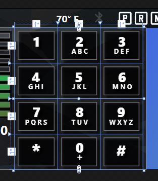
Figure:The phone page's number pad.
<Button x:Name="Key1Button" Command="{Binding phoneViewModel.KeypadEntry, FallbackValue={x:Null}}" CommandParameter="1">
    <Grid>
        <TextBlock Text="1"/>
    </Grid>
</Button>
<Button x:Name="Key2Button" Command="{Binding phoneViewModel.KeypadEntry, FallbackValue={x:Null}}" CommandParameter="2" Grid.Column="1">
    <Grid>
        <TextBlock Text="2"/>
        <Label Content="A B C"/>
    </Grid>
</Button>
<Button x:Name="Key3Button" Command="{Binding phoneViewModel.KeypadEntry, FallbackValue={x:Null}}" CommandParameter="3" Grid.Column="2">
    <Grid>
        <TextBlock Text="3"/>
        <Label Content="D E F"/>
    </Grid>
</Button>
<Button x:Name="Key4Button" Command="{Binding phoneViewModel.KeypadEntry, FallbackValue={x:Null}}" CommandParameter="4" Grid.Row="1">
    <Grid>
        <TextBlock Text="4"/>
        <Label Content="G H I"/>
    </Grid>
</Button>
<Button x:Name="Key5Button" Command="{Binding phoneViewModel.KeypadEntry, FallbackValue={x:Null}}" CommandParameter="5" Grid.Row="1" Grid.Column="1">
    <Grid>
        <TextBlock Text="5"/>
        <Label Content="J K L"/>
    </Grid>
</Button>
<Button x:Name="Key6Button" Command="{Binding phoneViewModel.KeypadEntry, FallbackValue={x:Null}}" CommandParameter="6" Grid.Row="1" Grid.Column="2">
    <Grid>
        <TextBlock Text="6"/>
        <Label Content="M N O"/>
    </Grid>
</Button>
<Button x:Name="Key7Button" Command="{Binding phoneViewModel.KeypadEntry, FallbackValue={x:Null}}" CommandParameter="7" Grid.Row="2">
    <Grid>
        <TextBlock Text="7"/>
        <Label Content="P Q R S"/>
    </Grid>
</Button>
<Button x:Name="Key8Button" Command="{Binding phoneViewModel.KeypadEntry, FallbackValue={x:Null}}" CommandParameter="8" Grid.Row="2" Grid.Column="1">
    <Grid>
        <TextBlock Text="8"/>
        <Label Content="T U V"/>
    </Grid>
</Button>
<Button x:Name="Key9Button" Command="{Binding phoneViewModel.KeypadEntry, FallbackValue={x:Null}}" CommandParameter="9" Grid.Row="2" Grid.Column="2">
    <Grid>
        <TextBlock Text="9"/>
        <Label Content="W X Y Z"/>
    </Grid>
</Button>
<Button x:Name="KeyStarButton" Command="{Binding phoneViewModel.KeypadEntry, FallbackValue={x:Null}}" CommandParameter="*" Grid.Row="3">
    <TextBlock Text="*" Margin="0" FontSize="24"/>
</Button>
<Button x:Name="Key0Button" Command="{Binding phoneViewModel.KeypadEntry, FallbackValue={x:Null}}" CommandParameter="0" Grid.Row="3" Grid.Column="1">
    <Grid>
        <TextBlock Text="0"/>
        <Label Content="+" FontSize="12"/>
    </Grid>
</Button>
<Button x:Name="KeyPoundButton" Command="{Binding phoneViewModel.KeypadEntry, FallbackValue={x:Null}}" CommandParameter="#" Grid.Row="3" Grid.Column="2">
    <TextBlock Text="#" Margin="0" FontSize="20"/>
</Button>Source:VehicleDashConcept - UI - DashboardPages - PhonePage.xaml.cs
Each square is a Button Control that has its Command Property set to the phoneViewModel.KeypadEntry ICommand, which accepts a string object as a CommandParameter; each time the user presses a button on the number pad, that number is added to the current phone-number-entry string (I only implemented numbers for this demo, alphanumeric behavior would be only slightly more complex). The phone-number-entry string appears in the area to the right of the number pad, which is where the current phone-status is displayed along with relevant communication data (Contact, call time, etc.). The floating encircled "x" is the button used to delete characters from the phone-number-entry string.
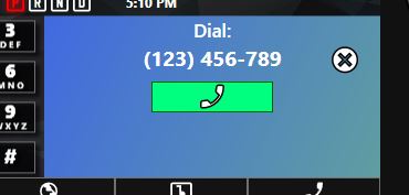
Figure:The phone page's status area.
This area changes to reflect different communication states that may occur during a phone call:
- Idle / No activity
- Phone number entry
- Incoming phone call
- Active phone call
To simulate a phone call, the PhoneViewModel uses a PhoneCommunicationState enum that is manipulated upon user input with the phone UI, such as when pressing the "Call" and "Hangup" buttons. The Timer object phoneDialTimer is used to create a fake delay between the act of the user dialing a number and another party answering.
private void OnDialPhoneNumber(object o)
{
    if (PhoneNumberEntry != "")
    {
        PhoneState = PhoneCommunicationState.OUTGOING;
        phoneDialTimer.Start();
    }
}

private void OnPickUpPhone(object o)
{
    PhoneState = PhoneCommunicationState.ACTIVE;
}

private void OnHangUpPhone(object o)
{
    phoneConnectedTimer.Stop();
    CurrentPhoneCallDuration = new TimeSpan(0, 0, 0);
    PhoneNumberEntry = PhoneNumberEntryDisplayString = "";
    PhoneState = PhoneCommunicationState.IDLE;
}Source:VehicleDashConcept - ViewModel - DashboardViewModel.cs
Additional communication-state context information is provided in the header, which would be visible even if the user were on a different page:
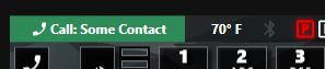
Figure:The phone page's header information readout.
4.3.5. Home
At the start of the project, I wanted the home page to contain at-a-glance / high-level overviews of the other pages, so I deferred creation of this page until the other pages were in place. This is a somewhat counterintuitive approach to rapid prototyping UI (assumption being that since the Home page is one of the first pages users will encounter during tests and project stakeholders will encounter during demos, it should therefore be one of the first aspects of the project to focus on), but this strategy paid off since I was able to incorporate pre-existing elements from the other pages.
Each main page in the UI (Driver, Navigation/Weather, Media, and Phone) is represented by a large Button that contains a summary of its content / state:
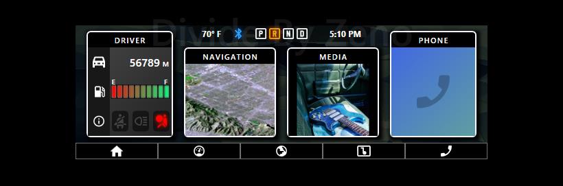
Figure:The Buttons on the Home page contain summaries of the other pages.
These page summaries are connected to their relevant ViewModel(s), so that any changes in the state of the pages are also reflected here. For example, if the fuel level changes, the change will show on both the Driver page and its Home button summary:
Figure:The driver summary on the home page reflects the state of the driver page's data source: DriverViewModel.
Another point of interest on the Home page is the horizontal bar meter used inside the Driver page summary. This is a UserControl that uses the same base class as the bar meter used for the volume control (see the Media Page section); horizontal and vertical bar meter UserControls were sub-classed in order to separate the differences in logic of horizontal layout versus vertical layout.
public class BarMeter : UserControl
{
    public SolidColorBrush BlackBrush = new SolidColorBrush(Colors.Black);
    public SolidColorBrush TransparentBrush = new SolidColorBrush(Colors.Transparent);

    public BarMeter() : base() { }

    public virtual void Redraw() { }

    public virtual void RedrawValue() { }

    public double CalculateBarValue(int barIndex)
    {
        double valueThreshold = (Bars > 0) ? (double)(Maximum / Bars) : 0;
        double barValue = (valueThreshold * barIndex) + valueThreshold;
        return barValue;
    }

    public Brush CalculateBarOpacityMask(double barValue)
    {
        if (barValue <= Value)
        {
            return BlackBrush;
        }
        return TransparentBrush;
    }

    ...

}Source:VehicleDashConcept - UI - Controls - BarMeter.cs
4.3.6. Test Tools
Since it can be very useful to test changes in application state during run-time (an understatement 😅), I setup a test tools section that enables the user to manipulate certain data-bound properties of the business logic, which, in-turn, manipulates the UI. Both page-specific and application-wide aspects of the program are able to be tested this way; since the Driver page has a large number of meters and indicators, I decided to use it for the page-specific test functions (although this method of testing could be applied to each of the pages). The "Toggle Screen FX" cycles through several different simulated lighting conditions, in order to approximate the effectiveness of the UI as if it were exposed to conditions likely to be encountered "in the field".
Figure:The test tools section in action.
The code behind the test functions are relatively straight-forward in terms of how the various input Controls are wired-up to the ViewModel. For example, the "Toggle Wireless" Button executes an ICommand, which in turn modifies the target business logic to be tested:
    <ToggleButton
Command="{Binding ToggleWirelessConnection, FallbackValue={x:Null}}"
Style="{StaticResource testingButtonBaseStyle}"
Content="Toggle Wireless" />
Source:VehicleDashConcept - MainWindow.xaml
                private void SetupViewModel()
{
    ...

    ToggleWirelessConnection = new DelegateCommand(OnToggleWirelessConnection, null);

    ...
}

private void OnToggleWirelessConnection(object o)
{
    WirelessConnectionState = (WirelessConnectionState == WirelessConnectivity.NOT_CONNECTED) ?
        WirelessConnectivity.CONNECTED : WirelessConnectivity.NOT_CONNECTED;
}
Source:VehicleDashConcept - ViewModel - DashboardViewModel.cs
Most of the remaining test functions adhere to a similar setup, with the only major differences being the functions that simulate the movement of the needles on certain Driver Page gauges; these required a bit more code in the form of System.Windows.Media.Animation objects. In order to simulate the needles of the Speed and Fuel gauges moving, I "animated" the underlying ViewModel properties connected to these gauges. Since the Windows Animation API can be used to change the values of Properties over time, I used DouleAnimation and Storyboard objects to change the values of the Speed and Fuel Properties in such a way that their corresponding gauges would show smooth, continuous movement over a short period of time (see the DashDial video here). This is really cool because this enables the DashDial control to be "black-box" tested (AKA testing an interface without having access / needing to have access to the internal interface code).
The following is the RelayCommand that is executed when the "Test Speed" Button is pressed:
private void OnSpeedTest(object o)
{
    DoubleAnimation increaseAnimation = new DoubleAnimation(60.0, new Duration(TimeSpan.FromSeconds(1.5)));
    increaseAnimation.EasingFunction = new CubicEase() { EasingMode = EasingMode.EaseInOut };
    Storyboard.SetTarget(increaseAnimation, this);
    Storyboard.SetTargetProperty(increaseAnimation, new PropertyPath(CurrentSpeedMphProperty));

    DoubleAnimation decreaseAnimation = new DoubleAnimation(0.0, new Duration(TimeSpan.FromSeconds(1.5))) { BeginTime = TimeSpan.FromSeconds(1.5) };
    decreaseAnimation.EasingFunction = new CubicEase() { EasingMode = EasingMode.EaseInOut };
    Storyboard.SetTarget(decreaseAnimation, this);
    Storyboard.SetTargetProperty(decreaseAnimation, new PropertyPath(CurrentSpeedMphProperty));

    Storyboard sb = new Storyboard();

    sb.Children.Add(increaseAnimation);
    sb.Children.Add(decreaseAnimation);

    sb.Begin();
}Source:VehicleDashConcept - ViewModel - DashboardViewModel.cs
5. Conclusion
And that's about it! If you have read this far, then I hope the article was enjoyable and/or educational. Thanks for reading! Here is the link to the complete source on GitHub.