Continuing from where Part 2 left off, this article details the process of converting the Adobe XD UI prototype into a Windows Presentation Foundation (WPF) and eXtensible Application Markup Language (XAML) implementation, as well as going over the unit tests written in NUnit.
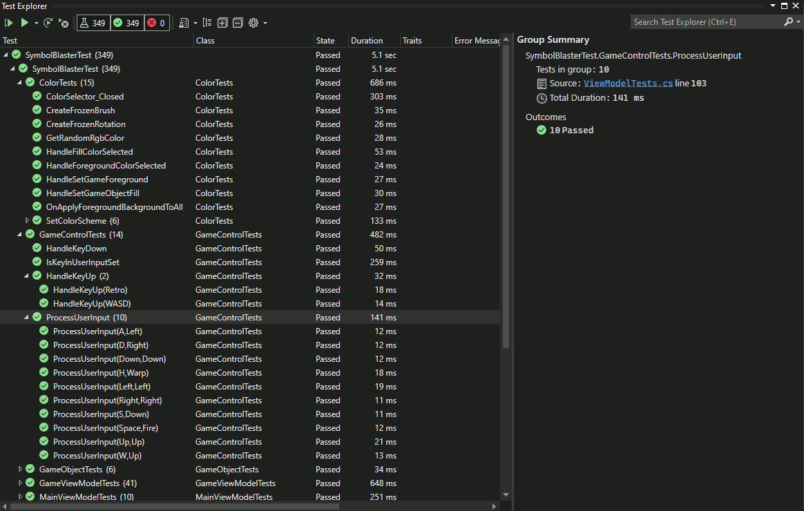
Figure:Visual Studio Test Explorer displaying the results of a successful unit test run.
Table of Contents:
1. Tutorial
The following is a general description of the thought process and steps taken to build this application from scratch, along with several in-depth descriptions of prominent features. It is not a complete step-by-step guide, but readers can follow along with the source code available via GitHub. The code snippets below will most likely not compile if copy/pasted on their own and are included only as quick references to the complete source code.
1.1. Implementing the UI
The UI was implemented in tandem with the ViewModel logic, in order to test the XAML Bindings of ICommands and Properties. Taking the prototype developed in Adobe XD, I was able to relatively easily port the style definitions over to XAML-based definitions. Most of the modular style definitions and resources for the view exist in the Resources/StyleResources.xaml ResourceDictionary; among the resources defined in this file include instances of Converters, strings for reuse throughout the UI, Brushes, Templates, and many Styles. I was able to define several hierarchies of Styles that derive from successive base Styles, including those for TextBlock and ButtonBase Controls, roughly analogous to the way that Components in Adobe XD work. In order to save time, I opted not to implement the transition animations that Adobe XD's Auto-Animate transition Type generated, but did implement the fancy sliding toggle switch animation using a StoryBoard object. The final WPF UI closely resembles the Adobe XD prototype envisioned, and only deviates slightly where necessary or convenient (such as to accommodate a visible vertical scrollbar).
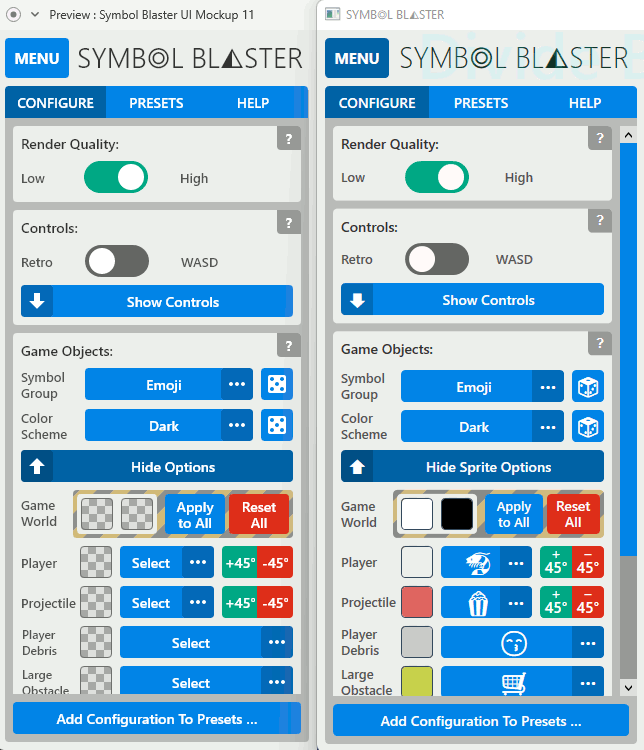
Figure:Adobe XD Prototype UI (left) and WPF application UI (right) side-by-side comparison.
<ResourceDictionary xmlns="http://schemas.microsoft.com/winfx/2006/xaml/presentation"
                    xmlns:x="http://schemas.microsoft.com/winfx/2006/xaml"
                    xmlns:viewModel="clr-namespace:SymbolBlaster.ViewModel"
                    xmlns:game="clr-namespace:SymbolBlaster.Game"
                    xmlns:system="clr-namespace:System;assembly=mscorlib"
                    xmlns:forms="clr-namespace:System.Windows.Forms;assembly=System.Windows.Forms"
                    xmlns:PresentationOptions="http://schemas.microsoft.com/winfx/2006/xaml/presentation/options"
                    xmlns:converters="clr-namespace:SymbolBlaster.UI.Converters">

    <BooleanToVisibilityConverter x:Key="booleanToVisibilityConverter" />
    <converters:FontSizeModifier x:Key="fontSizeModifier" />

    <system:String x:Key="gameObjectsSectionHeading">Game Objects</system:String>
    <system:String x:Key="controlsSectionHeading">Controls</system:String>
    <system:String x:Key="renderQualitySectionHeading">Render Quality</system:String>

    ...

    <SolidColorBrush x:Key="dropDownArrowBorderFillBrush"
                     Color="#33000000"
                     PresentationOptions:Freeze="true"/>
    <SolidColorBrush x:Key="toggleButtonCheckedBrush"
                     Color="#0761A6"
                     PresentationOptions:Freeze="true" />
    <SolidColorBrush x:Key="redColorBrush"
                     Color="#DE2F1B"
                     PresentationOptions:Freeze="true" />

    ...

    <Style TargetType="{x:Type TextBlock}"
           x:Key="MenuText">
        <Style.Setters>
            <Setter Property="Foreground"
                    Value="#333" />
            <Setter Property="FontFamily"
                    Value="{StaticResource mainFontFamily}" />
            <Setter Property="FontWeight"
                    Value="Normal" />
        </Style.Setters>
    </Style>

    <Style TargetType="{x:Type TextBlock}"
           BasedOn="{StaticResource MenuText}"
           x:Key="MenuSectionHeader">
        <Style.Setters>
            <Setter Property="FontSize"
                    Value="14" />
            <Setter Property="HorizontalAlignment"
                    Value="Left" />
            <Setter Property="VerticalAlignment"
                    Value="Center" />
            <Setter Property="Margin"
                    Value="8,8,0,8" />
            <Setter Property="FontWeight"
                    Value="SemiBold" />
        </Style.Setters>
    </Style>

    ...

</ResourceDictionarySource:Resources/StyleResources.xaml
1.1.1. Layout
The layout for the two portions of the UI, the sidebar and the game overlay, occupy different Columns within a Grid object. The column of the sidebar equals the sidebar's width, and the game overlay's column is set to "auto" width so that it resizes if the sidebar is shown or collapsed.
<Grid x:Name="interfaceContainer">
        <Grid.ColumnDefinitions>
            <ColumnDefinition Width="Auto" />
            <ColumnDefinition />
        </Grid.ColumnDefinitions>

        <!-- The game object canvas, which spans both parent Grid columns: -->
        <Canvas x:Name="canvas"
                Grid.ColumnSpan="2"
                IsEnabled="False"
                IsHitTestVisible="False" />

        <!-- The game overlay grid, within the second parent Grid column: -->
        <Grid Grid.Column="1">
            <Grid.RowDefinitions>
                <RowDefinition Height="30" />
                <RowDefinition Height="30" />
                <RowDefinition />
            </Grid.RowDefinitions>

            <WrapPanel Orientation="Horizontal"
                       HorizontalAlignment="Center"
                       Grid.RowSpan="3">
                <TextBlock Text="{Binding GameViewModel.LivesRemainingString, Mode=OneWay, StringFormat='{}L:{0}', FallbackValue=🎸🎸🎸}"
                           x:Name="livesRemainingTextBlock"
                           HorizontalAlignment="Left"
                           VerticalAlignment="Top"
                           Width="160"
                           Style="{StaticResource gameOverlayText}"/>
                ...
            </WrapPanel>
            ...
        </Grid>

        ...

        <!-- The sidebar, within the first parent Grid column: -->
        <Border Background="{StaticResource uiContainerBrush}"
                x:Name="menuContainer"
                HorizontalAlignment="Left">
            <Border.Style>
                <Style TargetType="{x:Type Border}">
                    <Setter Property="Visibility"
                            Value="Collapsed" />
                            ...
                    <Style.Triggers>
                        <DataTrigger Binding="{Binding IsMenuOpen, Mode=OneWay, FallbackValue=True}"
                                     Value="True">
                            <Setter Property="Visibility"
                                    Value="Visible" />
                        </DataTrigger>
                        ...
                    </Style.Triggers>
                </Style>
            </Border.Style>

            <Grid Margin="8">
                <Grid.RowDefinitions>
                    <RowDefinition Height="Auto" />
                    <RowDefinition />
                </Grid.RowDefinitions>

...Source:MainWindow.xaml
The game overlay Grid contains three rows for displaying various text items to the user, such as lives remaining, current score, and name-entry instructions; certain individual text items have DataTriggers defined that control their visibility corresponding to game state changes.
The sidebar layout consists of Controls that display a Menu button, the Symbol Blaster logo, and a TabControl. The TabControl contains three TabItems that each contain a major subsection of the UI.
<Border Background="{StaticResource uiContainerBrush}"
        x:Name="menuContainer"
        HorizontalAlignment="Left">

    ...

    <Grid Margin="8">
        <Grid.RowDefinitions>
            <RowDefinition Height="Auto" />
            <RowDefinition />
        </Grid.RowDefinitions>
        <Grid>
            <Grid.ColumnDefinitions>
                <ColumnDefinition Width="Auto" />
                <ColumnDefinition />
            </Grid.ColumnDefinitions>
            <ToggleButton Width="64"
                            Height="40"

                            ...

                <TextBlock Text="MENU"
                            Foreground="{StaticResource whiteColorBrush}"
                            Style="{StaticResource MenuButtonText}" />
            </ToggleButton>
            <TextBlock Grid.Column="1"

                        ...

                        Text="{StaticResource symbolBlasterString}" />

        </Grid>

        <TabControl Style="{StaticResource TabControlStyle1}"
                    Margin="0,8,0,0"
                    Grid.Row="1"
                    ...
                    >
            <TabItem x:Name="configureTabItem"
                             Style="{StaticResource TabItemStyle1}"
                             IsSelected="{Binding MainTabControlSelection, Mode=OneWay, Converter={StaticResource mainTabPageComparisonConverter}, ConverterParameter={x:Static viewModel:MainTabPage.Configure}, FallbackValue=True}">
                ...
            </TabItem>
            <TabItem Style="{StaticResource TabItemStyle1}"
                             IsSelected="{Binding MainTabControlSelection, Mode=OneWay, Converter={StaticResource mainTabPageComparisonConverter}, ConverterParameter={x:Static viewModel:MainTabPage.Presets}}">
                ...
            </TabItem>
            <TabItem Style="{StaticResource TabItemStyle1}"
                             IsSelected="{Binding MainTabControlSelection, Mode=OneWay, Converter={StaticResource mainTabPageComparisonConverter}, ConverterParameter={x:Static viewModel:MainTabPage.Help}}">
                ...
            </TabItem>
        </TabControl>
    </Grid>
</Border>Source:MainWindow.xaml
1.1.2. Configuration
The Configuration TabItem contains the main game settings and Controls that facilitate their display and modification. There are four main sections: Render Quality, Controls, Game Objects, and the Add Configuration to Presets button. The Render Quality and Controls sections contain ToggleButtons that use Binding expressions to display and modify the state of their corresponding ViewModel Properties; below is a snippet of the Render Quality ToggleButton XAML:
<ToggleButton ToolTip="Toggle game render quality"
                Command="{Binding GameViewModel.ToggleRenderQuality, Mode=OneWay}"
                Checked="ResetFocus"
                Unchecked="ResetFocus">
    <ToggleButton.Style>
        <Style TargetType="{x:Type ToggleButton}"
                BasedOn="{StaticResource MenuSettingToggleButton}">
            <Style.Triggers>
                <DataTrigger Binding="{Binding GameViewModel.RenderQuality, Mode=OneWay}"
                                Value="{x:Static EdgeMode.Aliased}">
                    <Setter Property="IsChecked"
                            Value="False" />
                    <Setter Property="CommandParameter"
                            Value="{x:Static EdgeMode.Unspecified}" />
                </DataTrigger>
                ...
            </Style.Triggers>
        </Style>
    </ToggleButton.Style>
</ToggleButton>Source:MainWindow.xaml
The Game Objects section contains Controls for selecting the current Symbol Group, Color Scheme, and Symbol and Color for each game object Type. The Symbol Group and Color Scheme have randomizer buttons that assign random values - I thought this was a neat feature to quickly experiment with different combinations. The Sprite Options Expander section contains a subsection for modifying the colors of the game background and game overlay, and contains Buttons for overriding the colors of all game objects at once; I decided to wrap this section in a "hazard" Brush since it would be very easy to accidentally erase individual color assignments if they were previously set on different game objects. In addition to color selector Buttons, The Player and Projectile settings have additional rotation Buttons that control clockwise and counter-clockwise rotation of their corresponding symbols, which can be used to visually align the player and projectile sprites depending on the default orientation of each.
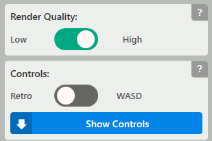
Figure:The Controls section in the Configure TabItem
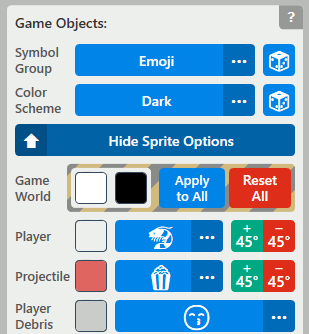
Figure:The Game Objects section in the Configure TabItem
The ColorSelector is a custom WPF UserControl I implemented to streamline viewing, choosing, and modifying colors. Since WPF does not have a built-in color selection Control, the closest alternative was to use the color selector from the Windows Forms API - but that control is simply too outdated and clunky in terms of UX, so I opted for the custom UserControl approach. ColorSelector uses RoutedEvents and DependencyProperties to handle user interactions. ColorSelector can be better covered in a dedicated blog post so implementation details are omitted here. Below are code snippets showing the GameViewModel using a ColorSelector to modify game object colors. Note that in the code snippets below, the Tag is set to the target game object Type and the gameObjectStrokeButton Style sets the CommandParameter to the Command's parent Control (the Button) - this passes information to the ViewModel on how to calculate the ColorSelector Popup's location and how to "route" a game object's color information.
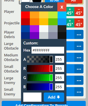
Figure:The ColorSelector Control.
<Button Style="{StaticResource gameObjectStrokeButton}"
    Background="{Binding GameViewModel.GameForegroundBrush, Mode=OneWay}"
    Command="{Binding GameViewModel.SetGameForeground, Mode=OneWay}"
    Tag="{x:Type viewModel:GameViewModel}"
    ToolTip="Set Game Color"
    Margin="0" />
Source:MainWindow.xaml
protected ColorSelector? colorSelector;
protected Popup? colorSelectorPopup;

...

// GameViewModel():
colorSelector = new ColorSelector() { PresetColors = new ObservableCollection(colorSelectorPresets) };
colorSelector.Closed += ColorSelector_Closed;
colorSelectorPopup = new Popup() { Width = 160, Child = colorSelector };

...

private void OnSetGameForeground(object? commandParameter)
{
    if (commandParameter is null || colorSelector is null || colorSelectorPopup is null)
        return;

    Control parameter = (Control)commandParameter;

    if (parameter != null)
    {
        HandleSetGameForeground(parameter, colorSelector, colorSelectorPopup);
    }
}

public void HandleSetGameForeground(Control parameter, ColorSelector selector, Popup popup)
{
    ResetColorSelectedHandler();
    selector.ColorSelected += ColorSelector_ForegroundColorSelected;
    selector.SelectedColor = null;
    selector.Tag = parameter.Tag;
    popup.PlacementTarget = parameter;

    Type targetType = (Type)selector.Tag;
    if (targetType == typeof(GameViewModel))
    {
        selector.CurrentColor = Config.GameForeground;
    }

    popup.IsOpen = true;
}

private void ColorSelector_ForegroundColorSelected(object sender, RoutedEventArgs e)
{
    if (colorSelector is null || colorSelectorPopup is null)
        return;

    HandleForegroundColorSelected(colorSelector, colorSelectorPopup);
}

public void HandleForegroundColorSelected(ColorSelector selector, Popup popup)
{
    if (selector.SelectedColor != null)
    {
        Color color = selector.SelectedColor.Value;
        Type targetType = (Type)selector.Tag;
        if (targetType == typeof(GameViewModel))
        {
            SetGameForegroundColorBrush(color);
        }
        selector.Tag = null;
        ColorSchemeCollectionView.MoveCurrentTo(ColorScheme.Custom);
    }
    popup.IsOpen = false;
} Source:ViewModel/ViewModels.cs
The Add Configuration to Presets Button spawns a Popup when clicked. The Popup contains a simple form prompting the user to enter a name for the current game configuration. If the user clicks the "Save" button, that preset is added to the list of custom GameConfiguration presets in the Preset TabItem.
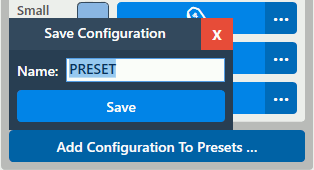
Figure:The Add Configuration Preset Button and Popup in the Configure TabItem.
<Popup IsOpen="{Binding ElementName=addConfigurationToggleButton, Path=IsChecked, UpdateSourceTrigger=PropertyChanged}"
PlacementTarget="{Binding ElementName=addConfigurationToggleButton}"
StaysOpen="False"
Width="224"
Placement="Top"
PlacementRectangle="0,0,40,40"
x:Name="addConfigurationPopup"
Opened="AddConfigurationPopup_Opened"
Closed="AddConfigurationPopup_Closed">
<Border Background="#2c3e50">
<Grid>
<StackPanel Orientation="Vertical">
<DockPanel Background="#34495e"
FlowDirection="RightToLeft">
<Button Style="{StaticResource ButtonStyle1}"
Width="32"
x:Name="closeSaveConfigurationButton"
HorizontalAlignment="Right"
Background="#e74c3c"
Foreground="{StaticResource whiteColorBrush}"
Click="CloseSaveConfigurationButton_Click">
<Button.Tag>
<CornerRadius>0</CornerRadius>
</Button.Tag>
<TextBlock Text="X"
FontWeight="Bold" />
</Button>
<TextBlock Text="Save Configuration"
HorizontalAlignment="Center"
Margin="8,-4,8,0"
Style="{StaticResource MenuSectionHeader}"
Foreground="{StaticResource whiteColorBrush}" />
</DockPanel>
<StackPanel Orientation="Vertical"
Margin="8">
<DockPanel>
<TextBlock Text="Name:"
Style="{StaticResource MenuSectionHeader}"
Foreground="{StaticResource whiteColorBrush}"
Margin="0,0,8,0" />
<TextBox FontFamily="{StaticResource mainFontFamily}"
FontWeight="DemiBold"
FontSize="14"
Height="24"
MaxLength="16"
PreviewKeyDown="ConfigurationNameEntryTextBox_PreviewKeyDown"
Text="{Binding GameViewModel.SaveConfigurationPresetName, Mode=OneWayToSource, UpdateSourceTrigger=PropertyChanged}"
x:Name="configurationNameEntryTextBox" />
</DockPanel>
<Button Margin="0,8,0,0"
x:Name="saveConfigurationButton"
Command="{Binding GameViewModel.SaveConfigurationPreset}"
Click="SaveConfigurationButton_Click">
<Button.Style>
<Style TargetType="{x:Type Button}"
BasedOn="{StaticResource ButtonStyle1}">
<Setter Property="IsEnabled"
Value="True" />
<Style.Triggers>
<DataTrigger Binding="{Binding ElementName=configurationNameEntryTextBox, Path=Text, Mode=OneWay}"
Value="">
<Setter Property="IsEnabled"
Value="False" />
</DataTrigger>
</Style.Triggers>
</Style>
</Button.Style>
<TextBlock Style="{StaticResource buttonText}"
Text="Save" />
</Button>
</StackPanel>
</StackPanel>
</Grid>
</Border>
</Popup>
...
<ToggleButton Style=""
BorderThickness="0"
x:Name="addConfigurationToggleButton">
<ToggleButton.Tag>
<CornerRadius>4</CornerRadius>
</ToggleButton.Tag>
<TextBlock Text=""
Style=""
TextAlignment="Center" />
</ToggleButton>
Source:MainWindow.xaml
1.1.3. Presets
The Presets TabItem contains Controls for performing CRUD operations on GameConfiguration objects. There are two main categories of presets: Built-In and Custom. For this reason, a TabControl that presents both sections and enables easy switching between the two categories is the main feature of the layout. Each category of presets contains a custom-styled ListBox with its ItemsSource Property bound to the corresponding CollectionView defined in the ViewModel. In the Built-In TabItem, the only interaction available is to browse presets and Load a selected preset. In the Custom TabItem, users can Load, Delete, Import, or Export presets. Importing or Exporting a preset invokes a FileDialog for specifying locations on the local file system. The code snippets below show the XAML Bindings and ViewModel Collection definitions for the Built-In presets:
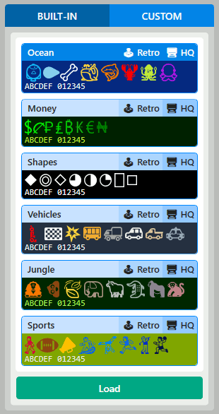
Figure:The Built-In presets TabItem.
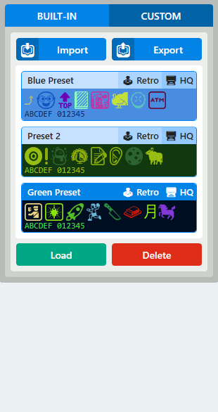
Figure:The Custom presets TabItem.
<ListBox Margin="-1,7,-1,-1" Grid.Row="0" SelectionChanged="ListBox_SelectionChanged" ScrollViewer.HorizontalScrollBarVisibility="Disabled" Padding="0,8,0,0" BorderThickness="0" HorizontalAlignment="Stretch" HorizontalContentAlignment="Stretch" Focusable="False" KeyboardNavigation.DirectionalNavigation="None" IsTabStop="False" ItemsSource="{Binding GameViewModel.ConfigurationPresetBuiltInCollectionView, Mode=OneWay}"> <ListBox.Style> <Style TargetType="{x:Type ListBox}" BasedOn="{StaticResource ListBoxStyle1}"> <Setter Property="Visibility" Value="Visible" /> <Style.Resources> <Style TargetType="{x:Type ScrollBar}" BasedOn="{StaticResource ScrollBarStyle1}" /> </Style.Resources> <Style.Triggers> <DataTrigger Binding="{Binding GameViewModel.ConfigurationPresetBuiltInCollectionView.Count, Mode=OneWay}" Value="0"> <Setter Property="Visibility" Value="Collapsed" /> </DataTrigger> </Style.Triggers> </Style> </ListBox.Style> <ListBox.ItemTemplate> <StaticResource ResourceKey="configurationPresetDataTemplate" /> </ListBox.ItemTemplate> <ListBox.ItemContainerStyle> <Style TargetType="{x:Type ListBoxItem}" BasedOn="{StaticResource ListBoxItemStyle1}" /> </ListBox.ItemContainerStyle> </ListBox> <Button Margin="0,8,0,0" Grid.Row="1" Command="{Binding GameViewModel.LoadConfigurationPreset, Mode=OneWay}" CommandParameter="{x:Static viewModel:PresetType.BuiltIn}" Background="{StaticResource greenColorBrush}"> <Button.Style> <Style TargetType="{x:Type Button}" BasedOn="{StaticResource ButtonStyle1}"> <Setter Property="IsEnabled" Value="True" /> <Style.Triggers> <DataTrigger Binding="{Binding GameViewModel.ConfigurationPresetBuiltInCollectionView.CurrentItem}" Value="{x:Null}"> <Setter Property="IsEnabled" Value="False" /> </DataTrigger> </Style.Triggers> </Style> </Button.Style> <TextBlock Text="{StaticResource loadPresetString}" Style="{StaticResource buttonText}" /> </Button>public ListConfigurationPresetsBuiltIn = gameConfigurations; public CollectionViewSource ConfigurationPresetBuiltInCollectionViewSource { get; set; } = new(); public ICollectionView ConfigurationPresetBuiltInCollectionView { get; set; } ... // GameViewModel(): LoadConfigurationPreset = new DelegateCommand(OnLoadConfigurationPreset, null); ... private void OnLoadConfigurationPreset(object? configurationPresetType) { if (configurationPresetType == null) return; PresetType? presetType = (PresetType)configurationPresetType; GameConfiguration gc = new(); if (presetType.Value == PresetType.BuiltIn) gc = (GameConfiguration)ConfigurationPresetBuiltInCollectionView.CurrentItem; else if (presetType.Value == PresetType.Custom) gc = (GameConfiguration)ConfigurationPresetCustomCollectionView.CurrentItem; if (Config == gc) return; PlayerControlMode = gc.PlayerControlMode; RenderQuality = gc.RenderQuality; ... SetPlayerSpriteRotation(gc.PlayerRotation); SetProjectileSpriteRotation(gc.ProjectileRotation); ApplyVisualUpdates(); }
Sources:MainWindow.xaml, ViewModel/ViewModels.cs
1.1.4. Help
The Help TabItem contains application documentation and Controls for modifying the size of text and reading area. Since I wanted to customize the appearance of certain items within the documentation (such as adding miniature resizable UI elements), I chose to use a series of TextBlock Controls containing Run objects. The alternative was to use WPF's FlowDocument API, but I found the FlowDocumentReader and FlowDocument to be too clunky visually and too difficult to customize. The beginning of the documentation contains a table of contents with links (custom Styled Buttons) that will scroll to the corresponding section upon click. The documentation is flanked by a row of buttons on the top, which control text size and sidebar size, and a row on the bottom, which contains a button that scrolls to the top of the documentation. I think that including text size adjustment controls are a huge quality-of-life feature for extended sections of text - and even entire UIs - since it gives the user additional flexibility depending on their particular hardware and viewing angle. The code snippets below show a portion of the documentation and the ICommands for adjusting text size:
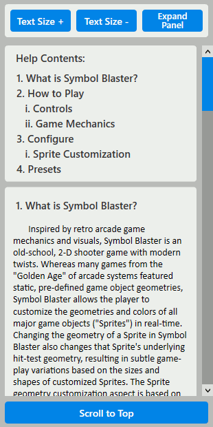
Figure:The Help TabItem.
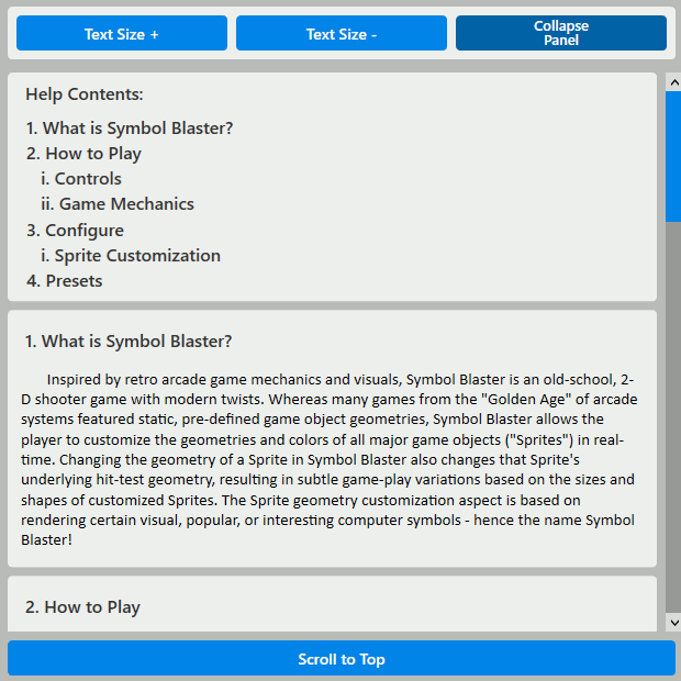
Figure:The expanded sidebar activated from the Help TabItem.
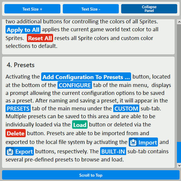
Figure:The documentation text with increased size in the Help TabItem.
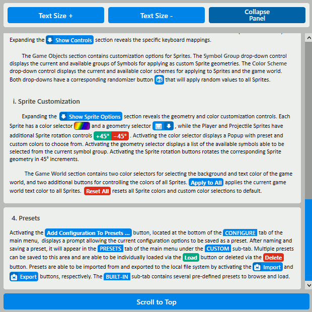
Figure:The documentation text with decreased size in the Help TabItem.
<Border Style="{StaticResource MenuSectionContainer}" Margin="0,8,0,0" Padding="8" x:Name="howToPlaySection"> <StackPanel> <TextBlock Text="{StaticResource howToPlay}" Style="{StaticResource MenuSectionHeaderAdjustable}" /> <StackPanel x:Name="howToPlayControlsSection"> <TextBlock Text="{Binding Source={StaticResource howToPlayControls}, Mode=OneWay, StringFormat='{} {0}'}" Style="{StaticResource MenuSectionHeaderAdjustable}" Margin="8,8,0,0" /> <TextBlock Margin="4,8" TextWrapping="Wrap"> <Run Text=" Gameplay is facilitated via keyboard controls that are mapped to Player actions. There are two different control modes available:" /> <Run Style="{StaticResource SettingLabelRunAdjustable}" Text="{Binding Source={x:Static game:PlayerControlMode.Retro}, Mode=OneWay, StringFormat='{}{0}'}" /> <Run Text="and" /> <Run Style="{StaticResource SettingLabelRunAdjustable}" Text="{Binding Source={x:Static game:PlayerControlMode.WASD}, Mode=OneWay, StringFormat='{}{0}'}" /> <Run Text="." /> ...public ICommand? ChangeHelpDocsFontSize { get; set; } ... // MainViewModel(): ChangeHelpDocsFontSize = new DelegateCommand(OnChangeHelpDocsFontSize, null); ... private void OnChangeHelpDocsFontSize(object? fontSizeIncrement) { if (fontSizeIncrement == null) return; double? addToCurrentFontSize = (double)fontSizeIncrement; // Enforce minimum and maximum font size to avoid oddities with extreme font sizes: if ((HelpDocsFontSize <= 8.0 && addToCurrentFontSize <= 0) || (HelpDocsFontSize >= 96.0 && addToCurrentFontSize >= 0)) return; HelpDocsFontSize += addToCurrentFontSize.Value; }
Sources:MainWindow.xaml, ViewModel/ViewModels.cs
1.1.5. Considerations
A number of considerations and concessions had to be made regarding implementation-specific UI challenges and "WPF-isms". The first issue is wrangling the default behavior of the WPF Popup Control. The Popup.StaysOpen Property determines the behavior of the Popup if an area outside of the Popup bounds is activated - StaysOpen = true will keep the Popup open, whereas StaysOpen = false will collapse the Popup. In modern UX, a typical experience with a dismiss-able popup is that it can be dismissed via an out-of-bounds click without triggering any underlying interface components (i.e. clicking to dismiss a popup will not activate whatever lies underneath that mouse click). In WPF, dismissing a Popup with StaysOpen = false by clicking out of bounds results in that mouse click tunneling through to whatever else is beneath that mouse click - potentially other Controls. This results in a humorous situation when attempting to dismiss a StaysOpen = false Popup by clicking on a Button responsible for controlling the Popup's visibility - if the Popup is open, and the user thinks to click the same button that opened the Popup in order to close it, the click event will first close the Popup and then immediately re-open it upon contact with the Button. The solution is to implement an invisible hit-test layer underneath the popup but above the rest of the interface so that such clicks are intercepted before they can tunnel through. This pattern is implemented for the Add Configuration to Preset Button and corresponding Popup:
<Grid Margin="8,0,8,8" Grid.Row="1"> <ToggleButton Style="{StaticResource RegularToggleButtonStyle}" BorderThickness="0" x:Name="addConfigurationToggleButton"> <ToggleButton.Tag> <CornerRadius>4</CornerRadius> </ToggleButton.Tag> <TextBlock Text="{StaticResource addConfigurationToPresetsString}" Style="{StaticResource buttonText}" TextAlignment="Center" /> </ToggleButton> <Button Background="#00000000" Opacity="0" Style="{StaticResource ButtonStyle1}" IsHitTestVisible="False" Click="PopupCloseHitTestBlocker_Click" x:Name="popupCloseHitTestBlocker"> <Button.Tag> <CornerRadius>4</CornerRadius> </Button.Tag> </Button> </Grid>private void AddConfigurationPopup_Opened(object sender, EventArgs e) { popupCloseHitTestBlocker.IsHitTestVisible = true; configurationNameEntryTextBox.Focus(); if (mainViewModel.GameViewModel.SaveConfigurationPresetName.Length > 0) configurationNameEntryTextBox.SelectAll(); } private void PopupCloseHitTestBlocker_Click(object sender, RoutedEventArgs e) { popupCloseHitTestBlocker.IsHitTestVisible = false; } private void AddConfigurationPopup_Closed(object sender, EventArgs e) { // WPF hack for dismissing Popup with StaysOpen="False" // when clicking a corresponding ToggleButton for showing/hiding the Popup; // Default behavoir results in "double triggering" the ToggleButton. if (!addConfigurationToggleButton.IsPressed) popupCloseHitTestBlocker.IsHitTestVisible = false; }
Sources:MainWindow.xaml, MainWindow.xaml.cs
The next issue was handling Keyboard focus. By default, certain WPF Controls are able to be navigated with arrow keys and Tab buttons. This can be problematic when attempting to use keyboard navigation keys for other purposes, such as for game controls. One of the solutions to this problem is to set the KeyboardNavigation.DirectionalNavigation Property to None on any DependencyObjects involved in UI interaction; however this only solves half of the problem, since activating a Control "focuses" it by default and will still have keyboard input routed to it. To solve this aspect, a dummy FrameworkElement is used, resetFocusElement, to serve as the new focus target whenever a Control would normally be focused, such as after a click event. Shifting focus to the resetFocusElement is accomplished by a small utility function in MainWindow.xaml.cs. An additional function IgnoreSpacePress(...) is used to intercept presses of the Space bar, which can cause inadvertent activation of WPF Controls if they have focus:
private void ResetFocus(object sender, EventArgs e)
{
    resetFocusElement.Focus();
}
private void IgnoreSpacePress(object sender, KeyEventArgs e)
{
if (e.Key == Key.Space && !configurationNameEntryTextBox.IsFocused)
e.Handled = true;
}
Source:MainWindow.xaml.cs
One of the last big issues that I have left unresolved is the delay incurred when opening a ComboBox with many items populating the ComboBox.ItemsSource. There is a noticeable delay of roughly 1 - 1.5 seconds when initially opening ComboBoxes that contain the available Emoji symbols, even with relevant virtualization options enabled. Opening the same ComboBox subsequent times reduces the performance hit to a tolerable level - I assume this is due to caching. However, in both instances, loading the ComboBox Popup blocks the UI thread, which is slightly frustrating. I have theorized about how to solve the initial performance hit, with the easiest solution probably being the addition of a "loading" game state upon application startup and changes to Symbol Group during which all ComboBoxes can "open" once before allowing the normal application flow to continue. An alternative solution could be to implement a custom UserControl that somehow preloads the content of a similar Popup mechanism. I decided to save that experiment for another day since this issue, although annoying, doesn't completely derail any major aspect of the overall project.
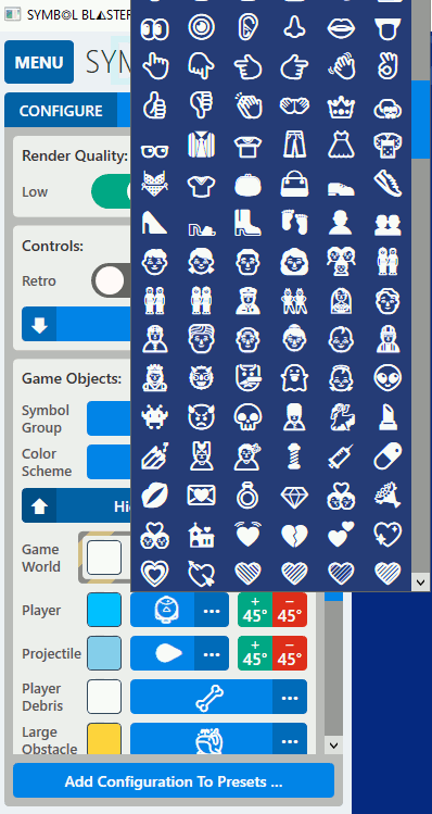
Figure:The ComboBoxes with large Popups incur a performance hit in terms of delayed opening and UI blocking.
1.2. Unit Testing with NUnit
Last but not least, I wanted to test at least a majority of the code to help prevent regression defects and improve maintainability. I find extra value in unit testing as a way to double-check and revise implementation details - I tend to believe that if something is difficult to test then it probably needs refactoring or at least extra scrutiny (with exceptions). For the sake of time, not all of the code is currently covered (at the time of this post), but a good chunk of it is.
Figure:Visual Studio Test Explorer displaying the results of a successful unit test run.
The tests are organized into several TextFixtures, each dedicated to a specific portion of the application or category of testing. For the Tests that involve UI components, I needed to use the [RequiresThread(ApartmentState.STA)] attribute. NUnit has a rich feature-set for automating certain aspects of testing that would otherwise be very time-consuming and tedious; among the Attributes used most in the Symbol Blaster test suite are Repeat, Random, Sequential, and Values. Below is a code snippet showing the definition of a testing class with a [SetUp] section and a [Test] function:
/// <summary>
/// Fixture for testing assertions involving game control user input
/// </summary>
[TestFixture]
public class GameControlTests
{
    GameViewModel gvm;

    [SetUp]
    public void Setup()
    {
        gvm = new GameViewModel();
        gvm.SetGameContainer(new Canvas());
    } random keys are correctly accepted/rejected as part of the set of user input keys
    /// </summary>
    [Test]
    [Repeat(20)]
    [RequiresThread(ApartmentState.STA)]
    public void IsKeyInUserInputSet()
    {
        Key key = (Key)TestContext.CurrentContext.Random.Next(0, Enum.GetValues(typeof(Key)).Length - 1);
        if (GameViewModel.UserInputKeys.Contains(key))
            Assert.That(GameViewModel.IsKeyInUserInputSet(key), Is.True);
        else
            Assert.That(GameViewModel.IsKeyInUserInputSet(key), Is.False);
    }

    ...

}Source:SymbolBlasterTest/ViewModelTests.cs
2. Conclusion
That about covers the aspects of WPF/XAML UI implementation and unit testing with NUnit. If you missed them, check out Part one and Part two of this series. The complete source is available via GitHub. Thanks for reading!